


Yesterday, I was toying with the idea of contrast achieved by using different stitches in an embroidery project. Today, I want to show you an update on my current church embroidery piece, where you’ll see a subtle contrast achieved through changing the thickness of the thread and switching to just a slightly darker shade of color.
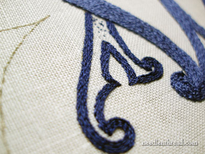
Initially, my plan was to use a different stitch for the second element in the monogram in this piece. After working the “M” in stem stitch using two strands of Soie d’Alger, the plan was to switch to a slightly darker shade of blue (which I did) and to fill the “A” part of the monogram with a chain stitch filling. I started to do that, but within two rows of stitching, I said, “NO.”
It was a resounding NO! It reverberated across the hills of Kansas. (Yes, we have hills.)
The chain stitch filling just didn’t work. Now, don’t get me wrong – chain stitch filling can work fine in all kinds of circumstances, but it just didn’t work here. Next to the smooth and flowing stem stitch (can you tell I like stem stitch?), the chain stitch looked bulky, bumpy, crude. I even re-worked the area using just one strand of Soie d’Alger, to see if the thickness of two strands was the problem. It wasn’t.
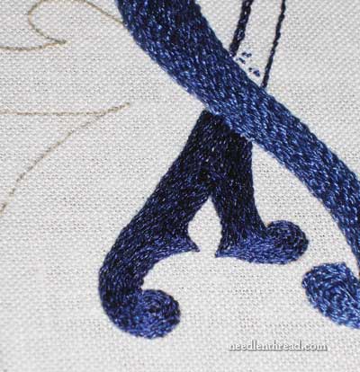
So… I reverted to stem stitch, and to achieve a subtle contrast between the two letters in the entwined monogram, I used one strand of Soie d’Alger with the slightly darker shade of blue. And I was much happier! Due to the use of one strand of silk, the darker blue does not sit as high on the fabric as the lighter blue, and it looks crisp and sharp, which is what I want.
These blues, by the way, are Soie d’Alger #4915 (the darker blue) and #4914 (the slightly lighter blue). They are perfect blues for this project. I love them! (But then, they are thread. And they are silk. What’s not to love?)
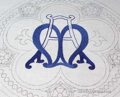
The moral of the story is that you can achieve a subtle contrast between elements in a design by changing the weight or thickness of the thread and switching to a slightly lighter or slightly darker shade, but keeping the same stitch. That’s what I’ve done, and I don’t regret it!
Keep in mind that, with church embroidery, it’s important that the elements stand out and can be discerned from afar. This monogram, when finished, would probably look a bit jumbled together from a distance, so some outlining is required after the filling is finished. The design will be outlined in gold, and then just outside the gold outline, I will probably work another tiny dark line to pick the whole thing up. But that’s quite a ways down the road!
And in fact, it’s farther down the road than you might think! Why? Because after getting to the point in the final photo above, I made a decision. You might not like the decision. I don’t like the decision. But it was one of those decisions that had to be made, and the sooner the better. In a bit, I’ll show you The Decision in pictures, and I’ll tell you why I took such a drastic step!
Here are links to other articles that show the progress of this project so far:
Setting up the Project
Beginning Stitching – stitch choice and laying tool
Using Gloves to Stitch with Silk
The Filled M
If you’d like access to all the tips and techniques discussed in the Medallion Project, including complete step-by-step coverage of the Tudor-Style Rose, conveniently collected in one document, interlinked, referenced, and indexed, why not add the Marian Medallion Project e-book to your library? It’s packed full of all kinds of embroidery tips for undertaking a project like this, all in a convenient electronic format for easy searching.
You got it right Mary. It looks grea.
What a tease you are! 🙂
Looking forward to finding out more about your project. I too like your design choice with color, thread thickness and thread choice. This is looking great.
If you don’t like your decision though, what are the chances that you’ll go back and rip it out until you like your decision?
I’m going to make a bet that you’ll rip it out.
😉
Thanks for the tip!
A question:Is the same technique in needlepainting?I want to start a new project in needlepainting style and I want to learn more about it.Perhaps in the future you want to talk more about this kind of needle work?Thank you!
Sorry for my english!It is not my first language…:)
Have a nice day!
Ooh, a cliffhanger. I don’t like the sound of a ‘decision that had to be made, and the sooner the better.’ But kudos for being stong enough to make it sooner!
It has a rich and regal look. The colors are very similar, too.
Oh, what suspense! Can’t wait to see what you’re up to – what could possibly be better than those gorgeous blues?
(and hills in Kansas??!! well, I never!!)
I’ve used a combination of stem/outline stitch and chain stitch to fill large areas. A row of chain and then tightly beside it a row of stem.Then another row of chain. Repeat as needed. May not do what you envisioned for this project, but fills a space quickly.
Thank you, I really enjoy your beautiful photos, and learn so much from your progress posts!
(do you have a photo of the chain stitch as a comparison for why it didn’t work?)
That monogram looks so elegant. Thank you!
Tessa – Nope, no photo of the chain stitch! I regret that – but it was in and then out again before I even thought of my camera! ~MC
Beautiful colours! The design is more and more fascinating. White on white church vestments are beautiful, but I like our design very much.
Mary, that is beautiful! I love blues. I am also glad to hear you play with different strand #’s. I am working on the circus pods pattern that you posted on your site and for the big side flower stems I decided to use 4 strands of DMC floss because I like the thick look of the split stitch. In fact I was going to satin stitch the big Pedals but when I saw you fill the M with the stem stitch I did the same thing. Wow! It ended up with a really cool swirl in the middle. When I get a little bit more done I will post a picture of my work. I just wanted to let you know I am a fan of a thick stitch. Some of my different elements look like weaved or knitted sweaters. I love your site and look anxiously everyday for your email.
Normally I would think that one would make the A and the M very different, as in blue/red, or blue/gold, not the different shades as you are doing in this piece. But it looks really great! Sometime subtlety is better than stark contrast. The gold outlines will definitely make the monogram initials stand out. It’s going to be a beautiful piece.
Big decision? Why do I think you’ve taken everything out? Or at least the “M”?
I’m on pins and needles….
Will wonders never cease! Hills in Kansas and Mary Corbett doing another droolingly beautiful embroidery…