


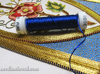
Ahhhhh. I love this color of blue! But I’ve never had a chance to use this particular blue silk thread, because it just hasn’t worked in any of my projects.
So I was Positively Delighted when I realized that I could finally incorporate this almost-electric-looking deep blue into the Mission Rose project.
It might be a little shocking at first to see the color – you might be thinking She’s nuts, that color won’t work!… but bear with me here!
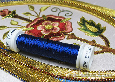
Not only am I adding a new color to the project, or at least a new shade (of blue), but it’s a different thread altogether than the silk threads I’ve used so far on the Mission Rose.
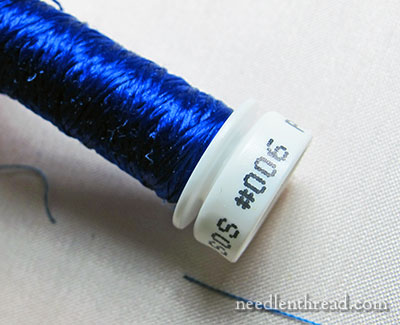
This is Soie Ovale, a flat (untwisted) silk thread, in color #006. It’s a brilliant, bright deep blue. It shimmers and shines.
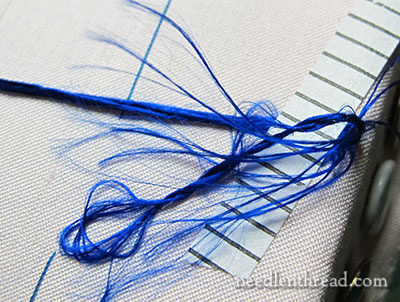
And because it’s Soie Ovale, it’s a little hairy to work with! Unlike the other twisted silks in the project that are much more manageable, this one takes a little bit more care while working with it.
(If you’re new to filament silks, this article on working with filament silks might be of interest.)
You can see above that I’ve taped the ends of the thread to the edge of my frame to keep them from flying about and getting too unruly.
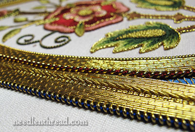
This is what I’m doing with the thread. It is wrapped around inside stretched coils of pearl purl, to outline the very outside edge of the whole piece.
You can see that I used the same method to outline both frames, the inner and outer frame on the Mission Rose. But I handled the gold a little differently for each frame.
You can see the outlines from a little distance here.
For the outline of both frames, I used this gold thread:
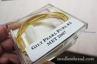
Pearl purl #3 is a heavy, solid goldwork thread. I stretched it, and wound silk into the middle of the coils for both frame edges.
You can read about couching stretched pearl purl and silk here. You can also read this tip on threading stretched pearl purl here. Threading the pearl purl won’t work with a really long piece of pearl purl, but it works with shorter pieces.
On the inside frame, I used the darkest red thread I used in the rose itself – 4624 Soie de Paris. This is a twisted silk that is divisible into 6 fine silk strands.
For filling the coil of pearl purl, I used 9 individual fine strands of Soie de Paris, and couched the pearl purl down with one strand, over the colored thread between each coil.
I stretched the pearl purl almost double – not quite, but almost – so the coils are pretty far apart, and the red really shows up.
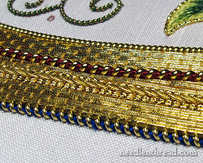
With the blue Soie Ovale, I doubled the length of the filling thread twice (so, four thicknesses of Soie Ovale in the middle of the pearl purl), and I couched it down with one thickness of Soie Ovale in each space between the coils.
To give the blue outline on the outer frame a slightly different look from the red outline of the inner frame, I did not stretch the pearl purl as much on the blue outline (so the gold coils are closer together), and I laid the thread down in the opposite direction to change the direction of the coils. You can see in the photo above how the red coils slant from lower left to upper right. The blue coils slant from upper left to lower right.
Why Blue and Not Red?
So, why the blue, and not just the red on the very outside of the piece?
The darker blue “finishes” the edge. It creates a dark line on the outside of the frame, so it holds the whole piece in. The red doesn’t do that the same way. And notice in the photo above that the blue doesn’t shock after all! It creates a dark outline with a hint of blue to it.
What’s Left to Do?
I’m not quite finished with this outside outline. It is slow going, working with the Soie Ovale. I’m working each side separately, rather than turning the pearl purl at the corners, because it creates a tighter, neater corner that way. Once the outside frame is completely outlined, I’ll tackle the inside of the outside frame (just the corners around the blue silk fabric and vermicelli work), and then place some finishing touches in the corners.
The Fluke – Again!
I have every hope of finishing the project this very day, should nothing strange interfere.
Remember this fluke I mentioned a few updates ago – when I told you that the electricity goes out every time I work on this project? Sure enough, when I sat down to it this past Monday, the power went out again. I know it’s ironic and coincidental, and I realize it has to do with the fact that it’s winter, windy, icy, and so forth. I couldn’t help laughing, though.
But hopefully, today will be The Day! Wish me luck!
If you want to see the development of the Mission Rose from beginning to end, check out the Mission Rose Project Index, where all the articles relating to the development of this project are listed in chronological order.
I love the blue! It’s absolutely perfect along that edge. When I was a member of our local quilt guild I can remember us having a speaker once who said that it’s wise to always finish a quilt with a darker edge…gives the eye something to stop at she said. I’ve remembered that and I can see it applies here. Oh, and have I mentioned how much I love blue??
Yes, I do sometimes think your color choices are nuts, but I’ve learned to trust your vision since they almost always turn out right. The way that gold vermicelli toned down that bright blue is a prime example. The rose is looking lovely!
No, no, no, you’re not nuts! I think that is the most beautiful shade of blue that I have ever seen! It’s such a bold, true colour – just magnificent!
Yes, it is very strange how your lights always go out when you go to work on the Mission Rose. Hmmmmmmm. . .
But I’m wishing you blessings and nice, speedy stitching (with no weird lights going out at random and inconvenient times!)
Can’t wait to see it finished!
Sarah 🙂
The blue is just perfect. It really does give a nice edge to the piece. I hope you can keep the power on and stay warm! The deep freeze is over, isn’t it? Now you just have normal, miserable cold.
Gorgeous!
The midnight blue is very pretty. I scrolled down to see the finished look, but I’m guessing you’ll do the corners first before the ‘reveal”.
About the odd fluke – it is on par with seeing a car come down your road just when you are ready to pull out of the driveway after having seen no traffic for the past several hours!
Mary, you are not wrong on the color! It really pops that edge.
The problem I am seeing is that I am so intrigued by how much you know that I MUST learn, I may have to give up quilting in order to learn it all. Now Mary, I have quite a bit of expensive machines and toys invested in quilting, and what am I to do with them? What a quandry. 🙂
Love your blog and it just gets better and better. The quality of your photos is #1!
Lynn
an sorry in spanish…
Diossssssssss debo felicitarle, primero ha documentado paso a paso todo, no ha dejado nada por fuera, ni se a limitado en compartir nada desde los vendedores de materiales, herramientas trucos, en fin, felicitaciones es excelente docente. No limita su conocimiento y comparte todo. Gracias. he leido cada articulo, Cada uno me dejaba con la boca abierta, hoy fue el colmo de todo… me encanta el azul esta espectacular, tengo una pregunta, ¿como hizo para mantener el hilo enrroscado al estirar y que cada espacio entre aro y aro fuese el mismo, como estiro para que la distancia siempre fuese la misma? Ok otra pregunta, al leer a los distribuidores de hilos, veo que dicen que el hilo puede empañar? y como mantienen el brillo de un trabajo? se puede lavar con bicarbonato? yo uso bicarbonato para limpiar mis piezas de orfebreria de metal, y quedan iguales, eso tambien sirve para la tela? o una vez que se pierde el brillo se pierde el trabajo? y no puedo esperar… y debo preguntar cual sera el destino final de este trabajo y como lo va a acabar, Que marco va a colocar; se que para mantener la orfebreria hermosa hay que garantizar que este bien cerrada, como es que hacen esto??? es que es un trabajo tan maravilloso, que es como para encapsularlo en el tiempo. y por ultimo gracias y FELICITACIONES…. GUAOOOO
Hello, Marianela –
I stretch the metal thread and it remains stretched. It does not bounce back. So the spaces are always the same, once the thread is stretched. I frame the embroidery under museum glass, to help slow down the process of tarnishing. The gold cannot be cleaned the same way as jewelry. The best option is to protect the work from sunlight and air by framing it well under good museum glass and to display it in a place that is not directly in the sunlight.
Best regards,
Mary
gracias… por aclarar creo que lo q acaba de hacer con el hilo dorado sera mi detalle final que voy a intentar ya en un trabajo… mañana le contare que paso… gracias por responder
Good luck – and what an absolutely gorgeous colour!
Ok – wow. Just when I think you have tackled and displayed every single detail — you go and do this. Awesome, Mary!
Stunning! Absolutely stunning! I just love that color of blue and I simply cannot wait to see the finished project. It has been such fun following you on this wonderful journey and it really makes me want to try my hand at goldwork! (Although I know it would never look as good as yours!!)
Hi Mary, as soon as I scrolled down to look at the shocking blue, I thought ‘Oh yes!’ The colour is just fabulous. I can see why you wanted to find a project to use it in. It works very well with the other colours here. I’m looking forward to seeing the full picture when you finish the corners, but I think that blue edging will set off the blue silk fabric beautifully. Can’t wait! Hope the electricity lasts long enough for you to complete Mission Rose as you have planned. 🙂
I think it’s a gorgeous color and a darker border will give the whole piece some “snap”. Looking forward to the finished piece!
G’day Mary,
Your Positive Delightedness in using the blue has turned out to be A Positively Brilliant And Pulchritudinous Idea. (The ‘P’ word isn’t in my vocabulary, or it wasn’t until noticed it just now in the online Thesaurus words of the day. What a hideous looking word for meaning beautiful! )
Cheers, Kath.
This has turned out to be so beautiful! Of course, we could see it was lovely just by the pattern (I love roses, stylized or natural) but the color choices and thread choices have really elevated this piece. I’m glad you are keeping this piece. Have you thought about the frame and the matting? Once you have it hanging on a wall, you’ll need to take a photo of it “in situ” so we can all see it. This is a truly beautiful work Mary, and you deserve to have it!!
Have you considered the use of a tekobari in keeping the threads? As you hold the thread at the top of its length, just before you put the needle back into the fabric hold the loop that forms, with a tekobari or a mellor, taut and follow the needle down into the fabric. This should control the fly-away that floss loves doing!
best wishes
jane kokoszko
Notts, UK
It’s TARDIS blue! That shade of blue added to any project is perfect, and I love the effect with the gold! Granted, I am really biased, especially with that shade of blue.
My goodness, that touch of deep blue has stopped the blue silk corners looking like they don’t quite belong to the rest of the design. A very good choice. Good luck with keeping the power on, Mary, so we can see the full, finished picture in all its glory before long.
Santa kindly provided me with several more reels of flat silk to add to my stash, and I am waiting impatiently for lighter days when I can see to stitch with them. I am a bit envious of you being able to use yours in January, but I don’t think I jinxed your electricity – I’m not quite that jealous!
Mary, this is just fabulous!!! I can’t wait until tomorrow to see the finished project – – fingers crossed that you have power from now until then so you can get it done. I have enjoyed every minute of this project – always the highlight of my day when there is an update – and the glamorous blue accent is a perfect finishing touch. Thanks so very much to you for letting all of us look over your shoulder!
The blue s absolutely necessary for me as it relates to the blue background and for me makes it “work”-good choice all around
The blue is gorgeous. Also, I think you ‘need’ the blue on the outer edge to complement the blue under the vermicelli.
That blue is amazing. Love the combination of textures in the frame and looking forward to seeing the finished piece.
This will be perfection! In my opinion, the blue will make the piece look like royalty! How beautiful!
MARY!!!! When are you going to start the project with the Secret Garden book? I have waited eagerly for a week!!!! 🙂
When I can, when I can! Hopefully in the next week or so!
Oh no, not quite yet. The book hasn’t arrived here in the Antipodes yet ….
Mary, this is a stunning work of art, and such an accomplishment. Your work is pure perfection. And I LOVE the blue 🙂
Tomi Jane in MN
Dear Mary,
At first I thought, Hooley Dooley! What have you done! But actually the electric blue does add definition and depth, as in another dimension of sumptuousness to the piece. It’s really beautiful!
Good luck – the Mary version of luck (diligent work and a wonderful shepherd), because I thought you said you don’t believe in luck. (I don’t either but I often catch myself wishing it for myself and others).
I can hardly wait to see how you work the corners and … the BIG reveal!
I had a pair of earrings in just that colour in the 80’s….just loved them. You needed that intensity of hue if the colour is going to ‘speak’ whilst wound around the purl, so it’s just right. The border is looking so so lovely.
Oh I love that blue, it is probably my favourite colour of all. It makes my soul sing. And I think it makes your edge sing too. It is just perfect.
Gorgeous ! And that beautiful blue is just the right color.
Oh, and good luck !
Dear Mary
What a lovely blue colour silk thread. I love the contrast between the red and the blue silk threads and how you used 2 different Soie silk threads and wrapped and couched them in the Pearl Purl gold and I like the different directions of the Pearl Purl you are an artist, it looks beautiful. I hope there are no more flukes as I can’t wait to see the finished project.
Regards Anita Simmance
Mary – the blue ‘outline’ in the Mission Rose is absolutely perfect. It is beautiful and I love your choice of blue. You are so right, the red would not have had the same effect.
Mary, I love it! Great choice!