How about some splashy colors in hand embroidery to start your week off?
Fact is, I’m still not sure about the floss colors I picked for this embroidery project!
And come to think of it, I’m not sure about the embroidery stitches I’ve chosen so far, either.
In fact, I’m not 100% sold on the project in general – the design, the colors, the stitches – but…. I’m still having fun stitching it and testing out ideas!
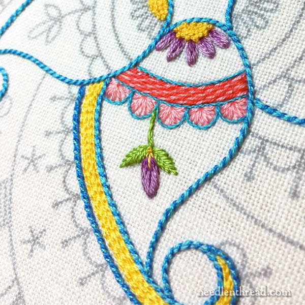
Selecting colors to use on hand embroidery projects is not always my forte.
There are some projects I’ve done, where the colors automatically fell into place and worked out just right.
But there are other projects where the color selection process was a slow slog resulting in dissatisfaction followed by new beginnings.
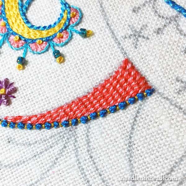
On this particular project (which doesn’t have a name yet – any ideas?), I wanted to use a small variety of stitches in bright and cheery colors.
And the colors are bright and cheery.
But perhaps they’re too bright and cheery?
There were two ideas that floated around in my head when I was selecting colors: birthday party and candy shop.
And (in my mind, anyway) I think the colors reflect those ideas.
But I’m also thinking something else comes across here. Something like Sugar Shock!
The alarm in my head is probably similar to the one that goes off in a mom’s head when her five-year-old becomes fixated on possessing one of those swirly lollipops bigger than a kid’s face!
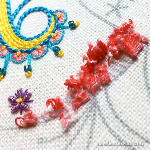
In any case, the stitching is fun! I’ve gone through a few trial-and-error bouts, but that’s all part of the process.
And I like the colors. I just don’t know if I love the colors!
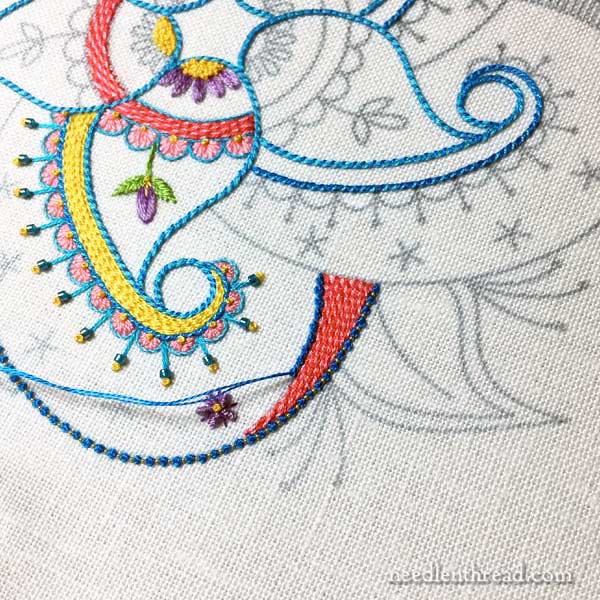
This particular pattern might work on a natural linen – like a dark oat color – in all white threads, too. There are some open spaces and backgrounds that would work well for pulled thread or drawn thread elements as fillings.
So many ideas, so little time!
I started this project up last week, while exploring ideas for a series of articles. I really didn’t intend to start a whole new project – just to stitch a few bits to demonstrate some ideas – but alas, I was sucked in!
I still have some adjusting to do on the design interpretation. I plan to enhance some background areas with a little stitching. Nothing too fancy or busy – just a touch of color to lift parts of the design.
So, what do you reckon about the colors? Do you like them or do you find them garish? Any comments, thoughts, suggestions? I’m all ears! Feel free to join in the conversation below!
Favorite Kaleidoscopes Pattern Collection
If you’d like to stitch up your own version of Birthday Bash, you’ll find the pattern available in my Favorite Kaleidoscopes collection – over 30 kaleidoscope designs for hand embroidery and other crafts.
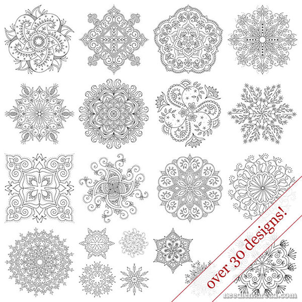
You’ll also find the patterns for Party in Provence and Tulip Festival) in the same collection!
The kaleidoscope designs range from small 4″ designs to large 8″ designs, from simple to complex. You can read about the collection in detail here, or jump straight over to my shop to grab your own copy!


Mary: The pattern and colors are beautiful. But I totally understand your dilemma. I am a quilter who is just returning to embroidery (I learned to embroider while growing up). Sometimes, you just have to wait until the project “speaks” to you. This is probably easier to do when auditioning fabric. But I trust you will know when the colors are right. Do you think you will sell the pattern in the future? Your website and YouTube videos are my “go-to” resources as I embark on this needlework journey.
Hi, Karla – Thanks! Yes, I’m sure this one will be available on the website in the nearish future. Just haven’t made up my mind how to make it available – I’m toying with some options. Glad you enjoy the videos and Needle ‘n Thread!
Ditto on loving paisley! The colors are beautiful. Paisley is very Indian and an Indian aquaintance once said it’s s place where pink is a neutral.
I love love love paisley so I love this design. I’ve tried to do smaller things in silk ribbon but I see now I need more space for the paisley details. I am trying to think of a candy paisley name…..or maybe paisley circus?
Hi, Lori – I think paisleys are a neat design element, too. I like them! Smaller paisleys would probably work better with floss rather than ribbon. Ribbon always needs a bit more room!
I mostly like the colours of this project – aside from my general dislike of pink, and purple to a lesser extent, they are often good for a project so I don’t discount them just because of that. The blue and pink shells are great as is the lovely little purple flower. However I really can’t get past the pink/red combination that you used – it’s not garish as such but just not a good combination IMO (it might just be me btw – but you did ask 🙂 ) and I’m really not liking that combination under the blue and pink shells.
Thinking about it it is of course difficult to mix red with many colours as you just end up with something hinting towards the Christmassy feel. Green and red of course would do this more than yellow with red, while white and red instantly bring candy canes and mint humbugs to mind. Red and purple might be too dark, though you are not using a dark purple or a dark red. I love the yellow (and white?) filling but I can see that you were going for a more varied colouring and that is a good choice 🙂
Not sure this is of any use but these are my thoughts either way 🙂
Thanks! The pink / red is actually pink / dark pink (more like a hot pink). They’re pinks in the same color family, but on opposite ends of the shade scale. Definitely playing with it right now – we’ll see how it works out!
Oh this is sooooo beautiful!!!
I love it! Love the pattern too. You do such beautiful work. Thank you for sharing.
I love the colors! I wouldn’t change a thing.
Check with your grey scale, they may be all the same intensity and that is why you are unhappy. They are adjacent colors and compliments should they should work together.
I agree with Cynthia. I love the colors, but they are all the same intensity and soft. You need some darker colors to help things pop more. It is always a thrill to watch a project develop and bloom under your needle as you stitch.
So far I love the colors! What’s the thread you’re using? I really like the design; will you post that one for us?
I’m just using regular DMC cotton floss on this one! Yes, eventually it’ll definitely be available!
Mary – I like everything you’ve done so far except for perhaps the addition of purple to the mix. What is always so amazing about your work is the consistency of your stitches. They are always the same size and that really makes your pieces simply beautiful.
Hope you are feeling A-OK.
Karen
Hi, Karen! I’m feeling pretty good, thanks! 🙂 Yes, I debated about the purple. I’m still debating about the purple. Hmmmmm…..
I love bright colors! especially on a monday! They empower us to go through the week, energize us to do good and be a source of cheer! Who knows where that may lead?
on a healthier note (although I prefer the alliteration of ‘sugar shock’) — what about ‘fruit punch’
happy stitching from she who has drunk 3 cups of coffee–can’t you tell? 🙂
I think the colors are perfect! I like bright happy palettes and this is perfect!
I love the colors! They suit this project which is supposed to be fun and not a formal piece.
Hi, Liz – Yep, that’s just it! I want it fun and informal – something that works for any kind of stitch or color preferences and can be worked just for fun!
I love the colors. Sometimes we need to make a dramatic change in our palette. We all have our favorite “safe” colors and when we get bogged down in a project we rarely think that it could be that we’re bored with the colors.
How about calling it Fiesta?
Absolutely love your daily letters. Hope your health is improving every day.
You are so up lifting.
🙂 Thanks, Marion! Ahhh – fiesta works, but I’ve already used it in another design in this series. Maybe I will trade names!
I love love love your colours! They are happy colours, full of vim, vigour and vitality!
Mary,
Sometimes it is good to “step outside of the box.” You may find as your stitching progresses you will love your color choices. I would continue and see what develops. Enjoy!
I think the colors are fun and cheery!
Dear Mary
I think they are the right colours for birthday parties and candy shops I don’t know how you think and draw patterns up so quickly and select thread colours. I think you are great at patterns, I couldn’t do this, it would take me days to think of something to draw and select threads, the different stitches are lovely and blend well together as do the thread colours. Names: Birthday delights, Candy swirls, as I said I’m not very good at new beginnings.
Regards Anita Simmance
I love, love, love the design and the stitches! Please share this one with us. Please.
Personally, I would change the intensity of either the yellow or the red. Maybe a darker red?
I feel very cheeky suggesting anything!
Hi, Marita – yes, the yellow looks a bit bright. It’s the thing that troubles me most – but it’s not quite as neon-bright as it looks in these photos, in person. I took the photos with my phone, and I wasn’t really able to get the colors to balance out enough for the yellow to be quite accurate online. What you’re seeing as red is actually a magenta / pink. It’s quite a shocking color, too. Still playing with it, so we’ll see!
I love the colors! Both the design and the colors remind me of folk art. I think they are beautiful.
I love the colors. They’re bright but cheerful and not overwhelming! Great job!!!
I love the colors… you go girl!
I love the colors! In addition to birthday party and candy shop, they make me think of summer in a place like Greece or the Caribbean.
I love love love the colors in your latest project! All colors are beautiful and if you are going for FUN I’d say you’ve accomplished that!
Sorry Mary, I’m just not wild about the colors in this latest project. Sometimes “less is more”. I have noticed that you like to use these colors quite a bit in your projects. I would like to see you do a project with subtle colors rather than the “in your face” colors you have used in this particular design. I think I would have toned down the yellow and used a bit more green. I’m not sure about the beads, I think I will have to see the finished project. As usual I so look forward to reading your blog. You have always written to real people with real difficulties when stitching. Thank you!
Hi Mary,
I love what you are doing. I think it is the patch of solid yellow that is niggling in the back of your brain. With bright colors, I’ve found that yellow needs to be in small spots here and there or scattered all across, but small. The eye tends to get sucked into the big patch of yellow and can’t get away. I realize that not everyone sees things alike, so it might just be me…
Hi, Sharyn! Yes, the yellow rather screeches, doesn’t it? In the photos, it’s a bit bright than in person. And I’ll be tying that into a bit more of it, so it doesn’t seem so isolated and bright. Not sure how it will work yet, but there’s still a bit of playing to do. We shall see!!
So beautiful. Love the colors and, of course, your technique is perfection. I want so much to try that project. My question to you and all people who do needlework and other crafts, what do you do with them once they are finished? I could literally cover my walls entirely with the projects of a lifetime. I CANNOT discard them.
It’s the age-old question, Judy! What to do with them! Lately, I’ve been experimenting with finishing designs like this into more useful things, like pockets on tote bags. Or, with this whole kaleidoscope series that I’ve been toying around with, they’d make great embroidered quilt squares. Stuff like that. They can also be broken down into pieces and used on corners of towels, pillow cases, things like that. I usually end up giving most of my embroidered samples as gifts, as I have a fairly extensive family that I always need Christmas or birthday presents for. But it’s a good question – there’s the whole joy of creating the thing and the love of the stitching process and so forth, but when it’s all finished, what do you do with it?
Boy, what a question! Here are a few ideas:
Put the embroidery pieces on a little shelf runner so that the embroidered part hangs down – maybe in a bookcase, to cover a row of boring book backs.
Make a little quilt ‘throw’ to put on the back of your sofa or a seldom-used recliner,or quilted together as a bed runner on a spare bed..
Use them in dresser scarves, on a sewing machine or printer cover, as part of a purse or tablet cover, or put them in a screen cover for a seldom used TV or computer.
Make chair-back covers for the dining room chairs – use velcro or zippers so the covers can be laundered without washing the embroidery…
If you have kids, you may have to be more inventive or just put them away while the kids are young.
I adore you neat precision stitching, Miss Mary. Mine go with free form so any balance is rare.
In colors, I only find the pink wrong. The outline blues are soothing. Rich orange is a contrast, that goes with purple and yellow. Maybe salmon where the pink is would fit better in my view.
With green, it seems to go with everything plant related. It is a background color for all blossoms.
I’m personally not a person to wear or use bright bright colours in my home……and I don’t think I’ve ever used such colours in my stitching…..but these colours in this piece seem to bring a joyous feeling to it. Not knowing what the finished piece will be, I can envision it as a table runner down a lovely wooden table….or a decorative pillowtop for a sedate couch.
Waiting to hear more about this. Perhaps it could be called Modern Crewel.
When I first looked at the design I thought there were too many colours so I tried blocking out the three purple designs but decided that leaving the centre purple half sunflower was good but omit the other two digits although your designs and colour choices are always perfect what do I know? What I do know is how much I enjoy your site your sense of humour and talent keep it up Liz from Surrey BC
I’m inclined to agree with you, Elizabeth. I debated about adding the purple at all!
LOVE the colors! LOVE what you have already stitched!
I like the cheery colors. But I think they may be too close to each other in tone and that the scheme might be helped by some greater contrast. You probably know this but an easy way to check contrast is to make a black and white copy of the threads and see what the gradations look like. Most home printers will make copies easily and you can lay a lot of skeins on the printer glass at once. Just don’t do what i did the first time — I laid the skeins with the numbers up forgetting that they wouldn’t be on the copy. All those threads are hard to identify in grayscale!
Hi, Robin – I like to check contrast by using the B&W option on my phone camera. It’s a quick way to do it, without having to print. 🙂 I know what you mean about the contrast. This may be part of the whole question that’s bugging me a bit.
What type of fabric are you using. I love the bright colors!
Linen! This is Alba Maxima. It’s about a 40 ct (threads per inch), closely woven linen that works well for just about any surface embroidery technique.
Are you kidding? It is a wonderfully fun selection of colors that work well. It is delightful. Don’t doubt yourself on this one!
What stitch are you using for the purple, part-of-a-daisy, thing in the first picture?
They’re granitos, but I’ve split them with another shade of purple, just to liven them up a bit!
I basically like the colors but not sure about the pink.But then I really don’t much like pink anyway. I gave up on embroidery since my stitches never look as good as yours. Or maybe I am just too old to do neat stitches.
Hi, Francys! Don’t give up on embroidery!! You know, the neatness of stitches is not the essential thing about needlework. The pleasure of doing it is the essential thing. Sometimes, my stitches are “too neat” – they’re too straight-laced to look free and easy and pretty. They end up looking like stiff soldiers, too formal. Stitches don’t have to be rigidly uniform – the “free” look of sketchy stitches is sometimes much more pleasing! So please don’t compare, and don’t give up if it’s something you love doing!
Francys,
I have been learning from Mary for years, and just this week realized something important. She takes those wonderful photos up so close that it makes the stitches look large. But they really are very tiny stitches. I was using #12 perle thread on a tiny doll pillowcase and I used the stem stitch but made my stitches so tiny and close together. It finally looked really neat like Mary’s photos! I made the stitches very close to the previous stitch, especially around the curls. So just try putting your stitches a little closer together and you might be surprised how good you already are! Hope you keep at it!
The vivid yellow draws in the other colors to remind one of your earlier fiesta piece.
When thinking of candy I would go a shade more pastel. I do like the white work idea better as a change of pace.
I must thank you for sharing about using photo boxes for storage. Those boxes are on sale at Michael’s for $16. I went crazy and bought 6. I not only stored all my Kreinick and other metallics, I have used a set to store my Au ver Soie a 3rdfor floche,
A 4th for gold work and Thistle work supplies, a 5th for DMC and the 6th is for
Specialty threads I love it and everything was easy to organize and now very findable ( with all the Kreinik in one place I may never buy metallics again!
This combined with your bead storage suggestion I am almost in command of of my stash – now to organize fabrics. But I am thinking of using Michael’s rolling carts with drawers for that .
Ooooo my heart leapt as I opened up this post… your brilliant design deserves a cheer!
(colors are by nature subjective, but turquoise does always push rainbows away; even the palest forget-me-not blue takes over the sky – maybe that’s why turquoise jewelry is nearly monochromatic?)
Love the candy shop idea of color. It is always so mesmerizing when going in a true candy shop because the color just calls to you. Go with the colors. I think it is happy and we all need happy now and then. Would love to see the whole design but what I see is fantastic.
I like the colours. I think you have to experiment sometimes because it’s easy to stick to the colours you like. It’s a carnival!
I LOVE it ❤️❤️❤️
So far I like what you are doing. It is cheerful and happy. Can’t wait to see what else you come up with. Of course I am bias anyway as I always like what you do.
Go for it! It brings to mind a Festival
I LOVE it! Design, Colors & Stitches…. A Whimsical Carousel is what it reminds me of. Glad you are stitching something different…LOL Nice to hear someone else has trouble with a design & colors…. that helps me to feel better when I’m indecisive. Some great stitch choices. Hope you finish it and we get to see the finish project.
You may not LOVE it, but I sure do. Can’t wait to see what is next.
Dear Mary; Just like you, I think I like all the colors you have chosen. Could you list out all of the different stitches you have used, the pictures don’t really show them very well.
Thank you,
Hi, Norleen – Not quite ready to publish a list of stitches on this one yet, as I’m still working my way through the project. Some of these may change drastically. 🙂
I love these bright colours. Your work is always so beautiful.
Thanks, Donna! 🙂
I love the colors. The blue is actually a bit muted, which I think makes the brighter colors glorious! I’d say go for it?
Oh Mary! This work and the thread colors are gorgeous! Love it!
Hi! Mary, I just love your project. I adore the colors. Can we see the full design….. Please continue with those beautiful colors. Can’t wait to see the full project finished.
I love the colors. I find them to be very cheerful!! And they remind me of springtime, which as the weather is cooling is uplifting!
I think the colors are just smashing, Mary. To me it is joyful. I am hoping that this might be a pattern that you will do an ebook, so those of us who can’t draw would be able to do. Thanks so much for sharing. Louisa
I do like your colors, reminds me of summer with all the flowers blooming different colors. I like the way you incorporated some beads with the embroidery. Your blue outlines of the shapes brightens the piece.
How about a name of HAPPY SWIRLS
Why, the colors are happy and the design has many swirls…
Good luck
I think these colors would be wonderful in a baby’s room! Always thinking about how to grab the next generation of stitchers.
bright colors looks like a sunny farewell to summer
Hi Mary,
I like the easy flow and movement of the curves, like a slow roller coaster where you wouldn’t be scared half to death. The colors are cheerful and I like the overall feel of the piece. It’s quite cheerful!
Judy
I like the colors. I also think that when you outline the colors with the dark blue, it damps them down a bit and ties them together.
I see your candy store/birthday party in the colors you have chosen. I like them. The finished project could be a pillow in a girls room.
I love the pattern and colors!! I would call it “Pastel Paisley.” Your work is simply beautiful!!
Looks like will turn out to look like a lot of fun! Oh happy dance!
Hi Mary,
I love Rainbow colors and pure bright colors. When I make quilts using that color theme, I put in a small strip of black and white patterns somewhere (checkerboard, stripes, dots) and use black as a border or outline for the colors.
If you try a more neutral darker color as the outlines of all the objects I think it will make the colors not feel so busy. I would try replacing the turquoise with black or a dark grey and see if the colors pop more. It’s really hard trying to use one of the Rainbow colors as an outline and have it be complimentary with all the other colors. If you don’t like that method, I would take sections of the piece and use a color palette for each section with a different outline color in each palette. I can’t see the whole design but neutral colors are a good mix with a rainbow palette. I can’t wait to see the whole design.
Robin
Mary I think you’ve done a great job. The colors are happy and work well together.
Definitely not garish, just delightful, fresh and bright but soft at the same time. I like it!
LOVE THE COLORS! Keep going!
I think it is such a playful, fun, light-hearted piece. The name that came to me that was Whimsical Moroccan! The design has a lightness to it that I think works well with the playful colors. And I love the pop the beads at the end of the straight stitch flowers contribute. Your stitches are just so ridiculously beautiful and consistent and such a joy to ponder and survey! Thank you always for sharing your beautiful inspiring work and I personally agree with other comments to let this piece takes its wings and see where you go together.
The colors and the design are both really exuberant & fun – so, I think it works wonderfully!
Hi from Aus – you mentioned drawn or pulled thread. To my knowledge there is only one lady in Italy who does drawn thread in colour. You might increase interest in drawn and pulled embroidery if it is combined with your sparkly colour scheme utilizing your zanny designs.
Love the pattern! I think the stitch choices are great. For me.. I think it’s the yellow that’s off. Maybe use a deep purple or brilliant red??
I’m a color girl, so I like the vibrant colors. I think the choices all depend on the mood you are trying to convey in the piece. These are happy colors. Again, I really like them.
I like the colors- I’d especially like them with a dark background..or maybe outlined in a dark color.
Your color choices look Italian to me. Italians have a lovely color sense. Or French. Definitely not garish 70’s hippie or flower child colors that put hot pink with orange just trying to shock. No, this is refreshingly pretty. . . . Somewhere I’ve picked up an idea that while pink and blue and other such pretty combinations are sweet, a touch of burnt orange, ochre, or an “off” color that you don’t really like will sometimes give your work real distinction. Nature does this. Hey, it’s very pretty!
Hey Mary!! As soon as I saw this picture this morning, I thought RAINBOW POP!! Don’t ask me why! My VERY FIRST thought!!! What do you think? LOVE the colors and the stitches! I think of it as a free for all in colors and stitches! I was having a mental feast of fun!! LInda in NC
They aren’t colors I would have picked but I actually like them, it reminds me of Easter.
I like the colors. But the pink has me second guessing. I know what you mean when you say ” I like the colors, I just don’t know if I love the colors”. The pink needs to be different. Oh my! what do I know I have a terrible time picking colors.
I love the colors and your stitching is impecable! Keep going.
I love the color combination. Sometimes bold is definitely better!!
I find it difficult to be critical when I admire your work so much, and your skill level and experience if SO above mine. But, I don’t like the pastel pink with the other bright colors. If you are going with bright and bold – which I think look great- commit! This may just be personal prejudice; I have never liked the color pink, and I admit that. As always the workmanship is flawless and a joy to examine. Thank you for sharing your doubts. It helps me accept my own.
Hi Mary,
Love the design as well as the colors. I have a difficult time putting many colors together and be happy with them. In looking at your beautiful work (I wish mine was as even) the color that doesn’t seem to work is the dark pink. When I look at it, my eye just stops on that color. Maybe a different pink or maybe you need to add another color that is darker like in the blues.
When you are done with it, I’m sure it will be wonderful.
Love you newsletters and spread word about your site every chance I get. Also, thanks a bunch about the tip on watching Craftsy for free last week.
Have a good day, happy stitiching.
Overall, I like the colors, and the design. That said, I think that the red tends to wash out the pink, and make it look very dull. Perhaps a deeper shade of red would contrast better with the pink. My opinion only!
Hi,
Coral is not bright. Dayglo Orange is! Your colors look great together. Paisley can handle bright colors!
Morning Mary: I agree with Karla, the colors are wonderful and I love the subtle bit of bling with the beads. I’m also a quilter getting back to embroidery. When choosing colors for a project I usually go for a dominant two warm or cool colors and then add a small amount of complimentary color (it’s what I call my “splash”). That or just pick two colors that go together and use a neutral to set them off.
Can’t wait to see how this turns out, with just a few stitches and a few colors it will be simple and quite often simple is beautiful.
Best regards ~ Brenda
It doesn’t matter to me that I don’t have these colors in my house’s décor pattern. They are SO much fun that they would be a delight to work on. In fact, as I sit here outside Atlanta dealing with the remains of Hurricane Irma, I think I would particularly relish these upbeat colors!
Wow! On first look, this pattern looks simple, but the interactive quality of the design components, I think, are somewhat complex. I am probably the last person to comment on how to bring out the beauty of the pattern, but it seems that the central component needs to be somehow grounded. Perhaps one could do a lightweights filling stitch where the paisley swirls overlap the center and then maybe, maybe do a lightweight decorative “something” over that filling to tie it to the rest of the paisley component. ??????? Or use a filling stitch in the central component which would then provide a background to and definition to the top of the paisley swirls.
I love the colors and I have every confidence in your ability to create a beautiful piece!
Take care,
Liz
Like the colors. Names are cute but SUGAR SHOCK is the best. Bright and cheery. I LIKED what I thought was a new stitch…but when I put my magnifiers on I saw it was an area you were deconstructing Is this an original design of yours?
I like it too…does look like fun.
I think it may be the yellow, I think it’s slightly off key with the others. Maybe a little more lemony would be better. It says birthday to me, as whenever I hear ice cream colours I think mint, sugar pink, peach and soft chocolate browns, rather than bright colour. I’m sure it will tell you what it wants, let’s hope it’s sooner rather than later!
I think the colors are good the design reminds me as some designs in the Aztec culture , indian colors
The teal (aqua) is one of my favorite bright colors, so I heartily approve of that. The lightish orange (sherbet?) works well with the blue. Anything brighter would be too much. I like the lavender too. What other colors are you planning to use? It’s going to be a fun and happy piece. I’m really curious about the stitches. Are you going to name those for us?
Hi Mary! New to embroidery here (been doing basic cross stitch for years) and I like the variegated “stem stitch” filler you’re using. What is the stitch? I’ve started a sampler to get some basic stitches under my belt but I’m kinda making it up as I go and I think that one might work well for me. Thanks!
Mary – it’s okay to have fun – even though – not a child. I love the colors – and the design. Keep it up – and hope to see more.
Blessings – Jane
Love what you do, as always, and even more: how you write about what you do. I love thinking about color, and so my two cents’ worth: the yellow and the turquoise are so strong and clear that they need other colors that can stand up to them. Even when I’m using DMC, I use Anchor 102 for a good purple that can hold its own. Pink is always tough; maybe #3806? Whatever you do, it will be wonderful. Thanks for sharing your fiber-y world!
I like all the colors, but don’t like the yellow in the swirly thing. It seems to be overpowering. It is great in the little dots though. Maybe a light green would work in the swirly area. At first I didn’t like the color that looks like coral on my computer next to the light pink, but it grew on me. Don’t LOVE it, but it is okay. Only the yellow is too bright! But I am not crazy about yellow anyway. Love your design.
Dear Mary
I like the colors. They are bright and cheerful, and when you think that we will soon be approaching winter and in the light of all the disasters just now we need something bright and cheerful. For me it works.
Louise
I like the colors and the stitching. You are overthinking it. Ha ha
I love, love, love receiving your e-mails. Each and every one is a day brightener as they are full of inspiration and instructions. Thank you for all your knowledge – how you share and present so many different aspects of stitching to so many…we are truly blest by having you in our lives.
I agree with the comments about tones. Perhaps a dull dark red or a dark blue would set off the bright colours?
I love the colours! Am new to embroidery – any chance you could mention the name of the stitches?
Se me permite está ótimo seu trabalho, se levar mais adiante o que destoa para você ficará mais claro.
Para mim está perfeito.
I always know what I will be using the project for before I decide on the embroidery threads and colors to use. Many designs from books or magazines appeal to me, but not necessarily in the projects used in them, so I change the materials and all else depending on my project.
Not either a “like” or a “dislike”, these colors make me feel vaguely uncomf0rtable! I think it’s the blue, which is one of my favorite colors, by the way. I keep wondering what this would look like if that part of the design were some green, instead. It’s very rare that I don’t simply fall in love with your color choices, but somehow this bunch. . . . .
I love the colors! It’s going to be a gorgeous piece!!!
First off…who am I to comment on your expert skills and knowledge!!
That said….at first glance it isn’t the piece but all the colors look the same, nothing is distinct…if you know what I mean. I trust you will perfect it all and in the end I will sigh at it’s beauty!
Hi, Mary!
I like the colors. They definitely say “candy store” to me, and they also say “tropical beach” or “coral reef.” I tried to choose a similar palette for a ceramic cross I painted with floral motifs, but I didn’t choose as well as you did. I chose yellow for my background color (not my favorite), but since so much of the cross was background, it turned out to be predominantly yellow. Your project feels predominantly turquoise to me, and I love it! I like having two shades of coral. I would probably try to use more chartreuse (because that’s a favorite of mine), but I suspect that it would overpower the piece. You have relegated chartreuse to leaves and stems, which I think will prove to be quite appropriate. I can’t wait to see the finished project!
I like all the colors you’ve chosen except the pinky-coral. I prefer pinks with more blue in them like the DMC 600-605 series. I would like to see those pinks substituted for the coral pinks. Or if that’s too blue, try the DMC rose series for a softer pink. I think the other colors work well together.
Just my personal opinion.
Oh my, I think the colors are positively yummy! Love the design as well. You are my “go-to” source for beautiful embroidery. Thanks for sharing your gift!!!
I love the colors. Not the real basic primary colors but a nice ice cream version. And in this hot weather, who wouldn’t welcome those? But you ripped out the section I liked. What was the stitch you used with 2 different colors? My embroidery skills are very basic and I can’t figure out how you got the 2 colors stepped so evenly .
Hi Mary, In a way I’m like you about the colors you’ve used so far. I’m torn between the dark coral and the light peach and the two different blues. You know, another thought for the piece might be “circus” and then you could really go wild. Of course, you’re probably miles ahead by now and your judgment on colors always seems to bring out the best in the overall picture so just keep playing but don’t get
“played out” with it. Just have fun. After all, it is supposed to be doing this for relaxation, aren’t you?
Dear Mary,
I like this design very much and would enjoy working on one like it. How can I get a copy? How do you come up with such beautiful and interesting patterns? If you draw them yourself, please teach a class on how to master the art.
Thank you and God bless
Peggy
I love to see bright lollipop colors on embroidery. While we may be drawn to more traditional colors, these colors draw in new younger stitchers. I will also share that I might have tried white French knots instead of the yellow, but who am I to challenge someone elses color choices. The white will integrate the ground fabric into the design and look like the frosting decoations on top of the cake. And 10 days ago was my birthday, thanks for this beautiful gift!
I absolutely LOVE the colors! It’s so nice to see some cheery fun colors 🙂
Thanks Mary!
I love bright colors. Your choices are beautiful.
Hi, I love, love, love these colors. The best description is most definitely Old Fashioned Candy Shop. A few years back I was visiting Brugges, Belgium my favorite city in the world and known for its handmade lace. It was Christmas time and the city center was decorated for the season. I happened to walk by a candy shop and had to go in. Of course in Brugges there are hundreds of candy shops but this one was special because there wasn’t a piece of chocolate in sight. It was the MOST AMAZING shop I have ever been in. Every possible type of candy (but NOT chocolate) was there. From lollipops of all sizes and colors, to licorice sticks to gum balls and jaw breakers to candy I had never seen before. It was brightly lit, sparkling clean and everyone was going in. It was getting dark and from the outside you could see the wonderful colors and smell the amazing scents and you wanted to taste it all. That is what this embroidery piece does for me! Sometimes it is just right to have some color overload. Perfect!
Love the colors and the Candy concept but you can’t have a Candy Shop without CHOCOLATE!!!
I love all the colors. An embroidery piece in brights are uplifting to the soul. The piece makes us upbeat! Keep stitching.
I like the colors. I sure do understand the feeling of finishing a project and thinking this didn’t work. In the end you have to do what makes you feel good.
Love the colors!!! And the design. I like bright colors and have a canning kitchen done in fiesta colors! LOL.!!
Hi Mary,
I like almost all colours, except the yellow, which seems to me a little bit « acid » (I don’t know if it’s the good word). But the design interests me very much. Will you show it entirely ?
Diane from Montréal in Québec
I do like the colours. Very fresh and pretty.
I like it
I think it looks bright and happy! Don’t change the colors! And your stitching looks sublime: it always looks so beautiful!! Hugs, H
I like those colors and the design. I even like the pink/salmon color you picked out unless you embroidered it back in. I love how you got the straight effect.
I like your color selection…a lot!! And candy store is exactly right.
I like the bright, fun colors! They make me feel happy!
I love lots of color. There’s enough drabness, sadness and so forth going on now everywhere these days,so I use color to lift my spirits. I’m more apt to wear or use bright, loud colors when its a stormy, rainy day, so that’s my opinion ! Bethel
I love your use of bright colours! My own colour choices tend to be too conservative so I’m always inspired when I see how you combine bright colours to such great effect. My only doubt on this is that particular shade of pink against the red – it’s fine against the yellow/blue – but that might be an artefact of the phone camera. Too soon to tell with only part of the design worked.
I like the color combinations. Sugar Sock is fun once in awhile.
It does us good to get out of our comfort zone once in a while,how else do we learn and expand our knowledge. You are inspirational. Keep up the good work with thanks. I think it looks great
I suggest naming your new project “Carnival”.
Mary, I LOVE the colors. This is going to be gorgeous!
Your chosen colors are beautiful – bright and fun!
It looks like fun! I love those swirly lines. I say keep going and see how it ends up. 🙂
Oh my gosh, I love this! Wonderful colors. Stay with it — I’m eager to see the finished project 🙂
Love the bright colors. They are just right.
I think it’s WONDERFUL! The colors do look just like one of those huge lollipops! My only comment is that they mostly seem to be the same value. Maybe you’d like it better if you had some darks tucked in and some very light POPS at the very end?
Mary I love the colors and the design. I am a sucker for bright colors. However, I understand your uncertainty. I look forward to seeing more of this happy piece.
I am new to embroidery … are you using floss or single skein? I started with floss but changed to DMC #3 as I liked the thickness and sheen. However, I found that it seemed to dislike being twisted so I stepped back to #5. Yours positively sparkle … and they are so smooth! Any suggestions would be so helpful! Thanks!!!
I love color….bright and cheery. I am not a pastels girl!
We all have a preference for certain colours…stepping outside those colours makes us feel uneasy….they may not be “wrong”…just not OUR colours. Using a different pallet however can open up a whole new world. I am also a quilter…and sometimes I buy what I consider the ugliest fabric to make myself step outside my boundaries….often those ugly fabrics become the heros.
I always love what you do Mary..regardless of the type and colour used….keep doing what you’re doing because the result is wonderful.
I just love the colors! Such a happy looking piece. I would have used these colors if this pic was in my coloring book!
I love the bring colors! I like the pink, and purple, and turquoise, and the yellow! I guess I like it all. The design has surprise and delight. And there’s movement — like when you spin in a circle because there’s so much to see. How about “County Fair” for a name — with the merry-go-round, a Ferris wheel, candy apples, and snow cones! Or something like “Summer Joy.”
Thank you, Mary, your work gives so much pleasure and joy.
There’s nothing wrong with bright cheerful colours, so long as there are other colours which are not bright to tone the overall piece down. Pale greys, soft browns and dull greens usually do the trick for me.
It’s beautiful, Mary! Lots of detail, colour and interest! My first thought was, “Ooh! I wonder where that pattern comes from!” Right up my alley!
Mary, I am with the people who can’t get past the pink/dark pink (looks red). I understand that it is candy cane thoughts but not my cup of tea and draws my eyes.
Just don’t think it compliments but distracts. No, I am not creative enough to suggest a substitute. I love how you throw yourself forward with an idea. It is fun.
Deb
I tend to be a bit of a colorphobe in my own work but that doesn’t stop me from enjoying colorful work done by others. I really like the stitching done with the alternating red and pink. It is so much more interesting like that as opposed to just a solid red or pink. My vote is to carry on! Also, I think a very simple title such as Candy Shop would fit it perfectly.
This project is off to a good start Mary. I like the colors. The coral stitches that you unstitched looked great. Whitch stitch did you use? Thank you for sharing your beautiful work. I’m stitching better thanks to you!
Hi Mary. Love your project _ your stitching is always so exquisite! And your colours too!
Mary, Mary. You can NEVER have colors that are TOO bright and cheery.
For the name – what about Swirly Flowers and Stars?
This looks like a fun project! As always, I can’t wait to see what you do with it.
I know exactly how you feel. I always tend towards bright colours, and often regret adding in one too many…but I think yours looks lovely, esp when viewed as a whole rather than in close-up. You get more of a harmonious sense.
I like the colors, but i also understand that it seems “not quite right”. Perhaps an inclusion of a deeper “jewel tone” of one of the colors to ground it just a bit ( a deep emerald green or sapphire, perhaps). The design is enchanting!
I truly enjoy your posts, I look for them in my inbox! Can’t wait for more.
Love the colors! Fells like a fair or carnaval, Ferris wheel and all!! How about “Pop!” for a name? Or “Carnaval ” ?
I’ve waited to comment while I thought about the colours. (The design looks very promising.) I’m afraid I do not like many of the combinations. I do like the purple/yellow half-flower, the suspended purple/green bud (?) and the purple ribbed wheel.
The blues are very hard; I dislike them against the other colours here. I do like the pattern of the swirls in the last picture.
The coral with the flecks is OK but I don’t think the blue adds anything.
I would be inclined to remove the pink; then the yellow swirl is OK. This shade of pink doesn’t work very well against the coral either.
J’aime beaucoup le motif et les couleurs utilisées
This project made me think of a “Dancing Circus”. How about that name!!!
I agree, it looks like a birthday party. Everyone loves a birthday party, don’t they? It makes people smile and feel good, That is what your does for me and I’m sure for many others. My trouble is knowing which stitches to use in order to have a variety. I tend to use only 4 or 5 familiar stitches.
Have a great day and thanks for fixing the glitch.
Dianne
I love, love, love the colors! They make me smile. I would call it “Paisley Celebration.”
Well, I love the colours!
I like your colors very much, especially for such a fun design. It needs some red and black too. Can’t wait to see!
I’d call it Flower Power Pop.
You need to add dark somewhere to let the eye rest. Your colors are great but they are competing with each other. Maybe all your beads can be dark or maybe you can add black somewhere though nothing speaks to me know for black.
I love the colours, but I do like bright colours. It looks really lovely.
I love the colors myself. I think it depends on what outcome you are looking for but personally I think these fit very well together and with the design as well. Beautiful stitching. I love any of those names you suggest, even “Sugar Shock”!!! Very catchy! A fun post Mary. Thanks.
I like the blues, the yellow, and the pink. I’m not sure about the medium coral red or the green or purple. Green and purple in moderation could be really good as a little pop, but all of these colors are really bright and only cover a small range of values, so there isn’t a lot of light/dark contrast to create structure in the piece.
I love everything about it!!! So pretty!
I love the colors you’ve chosen. I think that they are just out of your comfort zone so you are second guessing yourself. I say, just go with it…just for the fun of it. Let the colors be a visual vitamin and enjoy the lift of spirit that could result. I would love to stitch this design so I hope it’s available in the future. Hint hint!
A suggested name: Zenfrenzie
I LOVE the colours. It’s a modern enhancement to embroidery designs, makes it more attractive to new embroiderers
I love where you’re headed with this. The pink in the 5 little flowers doesn’t hold up to the bright colors, in my opinion. Maybe a purple to balance, or maybe that would be too much. Keep going, I’m loving it!
Mary, I like the colors on this new piece, but rather than the colors found in a huge lollipop larger than a kid’s face. The colors remind me of Jelly Belly jellybeans. I’m able to envision standing in a store that has every flavor in tall glass containers. Have lost count of how many times I’ve circled the display before I finally decide what flavors I want.
Realize I’m repeating myself from a previous post, but I really am so glad I found your web site. I’ve enjoyed every update you shared with us. Except for cross stitching that was so popular during the eighties, nineties and the early part of the 21st century, embroidery, for the most part, is a dying art. Other than joining the EGA (which I’d rather not do for I’m not interested in many of their projects), thank goodness for the internet. With the internet those of us that still hand embroider can all gather together as if we lived near one another. Thank you for sharing your wonderful talents with us.
When my husband and I purchased our house many moons ago, I became interested in working reproduction Samplers I purchased from The Scarlet Letter, knowing it was expected of young girls to perfect stitchery as part of their training to become young wives. As much as I enjoyed working and now looking at my Sampler covered walls, thank goodness women have progressed somewhat since those days. It’s up to those of us that embroider to make sure that coming generations don’t allow the ‘art of using needle and thread to depict the world around us’. I can’t think of a more relaxing hobby than embroidery.
Yours,
Susan S.
Hi, Susan! I admit, Jelly Bellies are my one weakness, when it comes to sweets. I can actually withstand chocolate temptations, but I do love the real Jelly Belly beans. I’m not quite sure why! Yes, I see why you’re saying embroidery is a dying art, but I think the last few years have enjoyed a resurgence of interest in it, which is definitely a good thing! I think the key for the future is going to be getting the youth of today interested in it. How does one do that? Well…. I don’t know. Exposing them to it, I suppose! And making it exciting!
I love this design and it’s colors.
Love your color choices, and your project.
You have been such a help to me and I’m actually getting
better.
Thank you, I love embroidery.
Janet
Hi, Janet! Thanks for your comment – I’m glad you find Needle ‘n Thread handy for your embroidery pursuits!!
I love it … it caught my eye … when can we have the pattern please. Is this on Patreon.
The pattern is in the e-book listed at the end of this article (Favorite Kaleidoscopes). You can find the PDF with this pattern in it – and many other kaleidoscope patterns – available here: https://shop.needlenthread.com/product/favorite-kaleidoscopes-a-design-book-for-hand-embroidery
Hope that helps!
I would love to attempt this but you don’t give us a clue on where to find or purchase the pattern to start it. Can you help?
Hi, Christine – The design is available in the “Favorite Kaleidoscopes” PDF that I talk about at the end of the article above. You can find it directly here: https://shop.needlenthread.com/product/favorite-kaleidoscopes-a-design-book-for-hand-embroidery