


I’m determined that this monogram from A Sea to Stitch by Elisabetta Sforza (you can read my review of that project book here) will be finished before January comes to an end! (Update, May 2021: yes, well, that didn’t happen!)
But then again, there are two more projects underway that I keep saying the same thing about. Oh dear.
Here’s a project update. I’ll tell you a few things I’m doing differently and share some whys and wherefores. Come, let’s take a look…
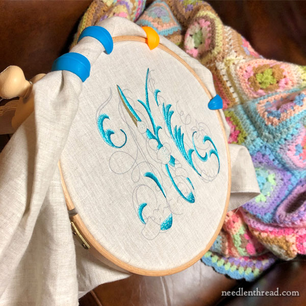
Here we have it, in the hoop, on the stand, in the glaring light of my stitching lamp at 6:00 am. It looks awfully wide awake for 6:00 am, doesn’t it?
I’ve finished all the water elements on the letter, and I’m just starting the background sandy parts.
Now, for thread, I’m using my own color palette in Au Ver a Soie silk threads. Although they’re coming across a bit bright on my monitor, I think you can get a good idea of the layers of colors, anyway.
I’ve used four shades in this bright turquoise-greeny-blue color family, and I’m using two strands of Soie d’Alger for the stitching. Soie d’Alger is a stranded silk, meaning you can separate finer strands out from the main thread. When working rows of stem stitch like this and switching between shades, I usually blend the colors in the needle.
So, to clarify how I do this, let’s assign letters the four shades I’m using, calling them A, B, C, and D.
I’ll work the rows in this color sequence, with two strands in the needle at a time: AA (two strands of A), AB (one strand of A and one strand of B), BB, BC, CC, CD, DD. This way, by blending two shades in the needle at once (AB, for example), I get a kind of heathery blending between the solid shades AA and BB.
Sometimes, I’ll fill an area with more solid or more heathered color, depending on what I’m trying to do.
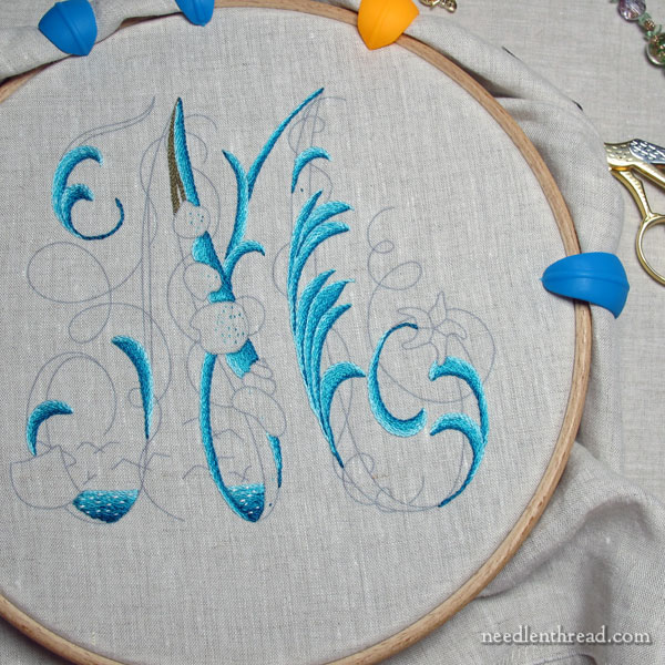
The lighting isn’t giving the best sense of color blending, but you can get somewhat of an idea from the photo above.
I’ve written about this approach to shading with stem stitch on another project, and you’ll find that article here, if you want to delve into it a little more.
In any case, I tried to blend the layers of colors a little bit more than the way they are presented in the book, but I’m not quite sure I like it. I think the layers of colors in the water areas of the monograms lend a “movement” to the design that lacks in my version. I’m kind of regretting the blending. But we’ll see how it turns out in the end.
The other regret that I have is not building up some lighter edges in certain areas of the water elements. I’ll see how it plays out in the end – I might not mind it so much when the letter is finished. We shall see!
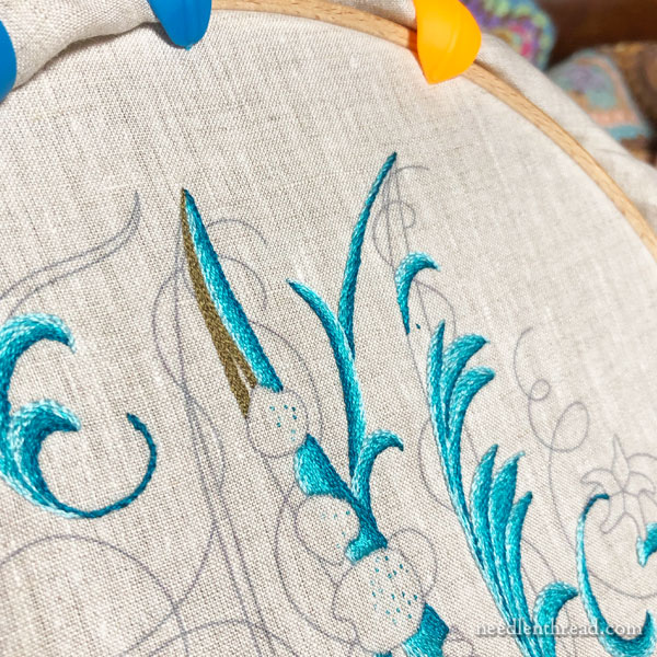
This is not the original color I had planned for my sandy fillings on the letter. Because the water elements lean more towards a tropical sea, I played with more of a white-stone-sandy look (and forgot to take pictures) and then a very light gold sandy look (and forgot to take pictures), but neither gave me enough contrast with the background fabric.
So I went for a much deeper color for the shore line. And I opted eventually for split stitch filling with one strand of silk.
I found that, working the sand area in the same weight (two strands) in stem stitch didn’t “lift” the water as much as I would like. Part of this has to do with the fact that I didn’t use more of the lighter shades on the edge of the water, I think.
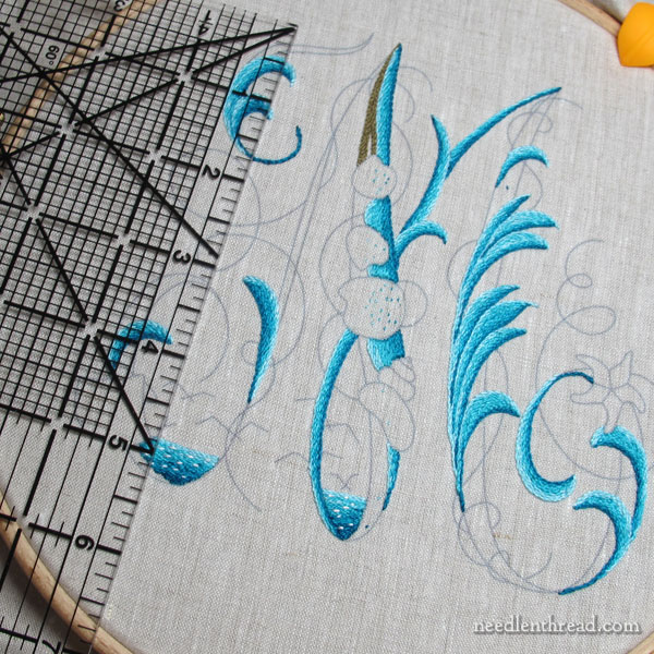
As I started working the sand areas, trying out different colors and stitches, I wondered why I didn’t work the sandy areas of the design first, since it seems to me that the water sits on top of them, and normally, I work my embroidery starting with the elements farthest back in the design.
But I don’t think it matters for this, and I’m not worried about it!
So I started out on the sandy parts of the shoreline with two strands and stem stitch, but it didn’t distinguish the sand as much as I wanted it to, so I switched to one strand, to see if the change in weight would give me the look I wanted. It didn’t, really, so I switched to long and short stitch with one strand.
The long and short stitch result was a little more towards what I had in mind, but it was almost too smooth and … fluffy? (for lack of a better word). It didn’t set the stitches close enough and tight enough into the fabric. And it didn’t leave the sense of light texture that I was aiming for.
I eventually chose split stitch with one strand to make the sand area look more compact, to make it seem a little harder (think wet sand on a shore line), somewhat smooth, and yet still retain a little texture.
I think I’m going to like the split stitch here. Again, we shall see! The design calls for scattered French knots over this area. I’m going to try beads instead. I’m eager to see how they will play out, and whether or not they will actually work well or look silly!
I’m working a large version of the letter. It’s almost 6″ high, which seems practically gargantuan.
My plan is to finish this design into a kind of memo board similar to those you can see in my review of Elisabetta’s book, towards the end of the article. I’m planning on combining both of those finishing ideas into one memo-type board. I have a frame that’s made from barn wood that I think will work well for this. And hooks – the best little hooks!
The fabric I’m stitching on is a relatively large square. The opening on the frame that I want to use is 14″ square, so I added 3″ on all sides on my fabric cut (a total of 6″ – so a 20″ square of fabric), to give me room for finishing. That’s why I’m using those spool huggers to hold the excess fabric out of the way. (You can read about spool huggers and how I use them here.)
Two Books Available!
If you want to stitch your own version of one of Elisabetta’s Sea-to-Stitch monograms, you’ll need a copy of her book, which is available right now in my shop. You can read my review of her book here, if you want to see the beautiful designs and colorways she uses, as well as all the details of what you’ll find in the book.
I’ve also brought in a limited number of In a Wheat Field, also by Elisabetta, which I reviewed here. It’s such a lovely alphabet, with poppies, cornflowers, daisies, wheat, and bluebells – very delicate, very sunny and cheery! This particular book is not as large a book as A Sea to Stitch (hence, the price difference), but it has everything you need (designs, materials and instructions) to stitch the letters and other motifs, presented in both English and Italian.
Dear Mary
Wow you started really early, I wish I could do that get up early and just embroider or in my case at the moment continue with making my little deer felt family. I find concentrate better in the morning, but unfortunately life gets in the way. Anyway the Sea to Stitch project is coming along nicely I like the stem stitch or split stitch for the sand and I’m looking forward to seeing what beads will look like on the project. I love the colour of the sea it looks so inviting. I really like the spool huggers great accessary to have for keeping the fabric out of the way of the stitching. Thanks for sharing with us your progress on a Sea to Stitch and for your tips and techniques on the stitches you are using for the project.
Regards Anita Simmance
LOL! I wasn’t stitching just yet at 6:00… I had just walked into my studio to get to work. I turned the light on to take a photo of where I left off yesterday. I get more done in the early mornings than I do in the late afternoons and evenings. I’m definitely a morning person!
Dear Mary
Oh sorry, yes like you I get more done in the morning then late afternoon or evening. Happy Stitching
Regards Anita Simmance
🙂 There are times when I wish it weren’t so. The mornings never seem to last as long as the evenings! LOL!
Dear Mary
Thanks for your reply. Yes I agree the mornings go so quickly in fact the days go so quickly even in lockdown. Take care stay safe.
Regards Anita Simmance
I’m disappointed you are already sold out of In a Wheat Field. I do want one of those sometime.
Hi there, Alana! I’m surprised, too! If you could drop me an email, I’ll put you on the advanced notice list. I’ll try to get more in from Italy pretty quickly.
I’m sure it will be beautiful when finished. What are those rubber clips that are on the hoop called?
Hi, Sue – I talked about those towards the end of the article there, and provided a link to this article about them: https://needlenthread.wpengine.com/2019/11/embroidery-hoops-excess-fabric-huggers.html
Gotta love those blues ….
I acquired the RSN embroidered boxes book for Christmas. I like it a lot, but I’m disappointed it doesn’t include the box pictured on the front cover! Some guidance on how to get things matching up would be useful, I think.
This is looking amazing. Will be fantastic when finished. The colours are of a bright summer afternoon – and we could use that right now. I have the book and will try my own monogram in due course. There was another item of interest in the picture! I have to ask- what were the blue and orange y grabber things to hold the rolled up fabric out of place- they look so useful?
Thank you for your entertaining blog.
Hi, Trisha – Glad you like the project so far! If you keep reading the article, you’ll find the information on those blue and orange grabber things! 🙂 There’s also a link to an earlier article on them.
I love this, you colors are so beautiful.
I view all these magnificent museum worthy needle art projects with great solemnity and respect but have not yet found the way to ease into taking my own first stitch on same. How can I continue to pride myself on being a Woman of the Needle but have such tremendous fear of getting into more project complexity than I can find my way through? Each needle art project is voluptuous eye candy which may just be too rich for my plain stitching. I am struggling to remain hopeful.