


Just a wee update on the Secret Garden embroidery project, for those who are following along.
And for those who are just joining up here on Needle ‘n Thread (a big welcome to new subscribers!), a little background information. This particular embroidery project came about when I discovered Johanna Basford’s book, Secret Garden: An Inky Treasure Hunt & Coloring Book, which I reviewed last year as a source for embroidery inspiration.
I contacted the author and squared away permission to stitch the project and show the development of it here on my website – the only caveat is that I can’t share the design with you. If you want it, you’ll find it in Johanna’s book, along with other delightful drawings that could translate well into embroidery.
For those who aren’t that keen on the project itself (you might be thinking, I would never embroider that!), I try to incorporate little tips, ideas, all the mistakes and their fixes, into the articles as the project develops, so that everyone can learn at least something from the project, whether you’re ever going to embroider it or not.
I love to get reader feedback through suggestions, comments, and questions, which can be found at the end of any article on Needle ‘n Thread. The collective needlework community here on Needle ‘n Thread is a great resource for inspiration, ideas, guidance. Since embroidery is never a matter of “only one way” to do things, it’s great to have so much input from such a knowledgeable, enthusiastic community.
All the articles relating to the project are listed in chronological order in the Secret Garden Hummingbirds Project Index, which is found under Tips & Techniques in the main menu on Needle ‘n Thread, where you can find many other hand embroidery lessons & step by step projects.
And now, I’ll quit my burbling here and get on with the update!
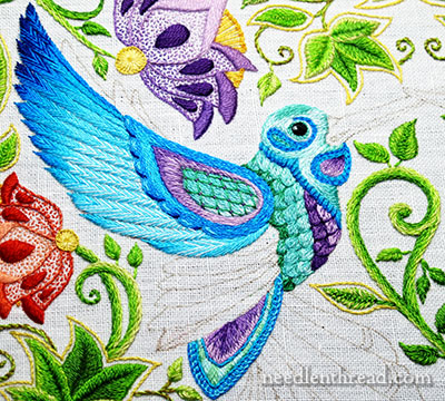
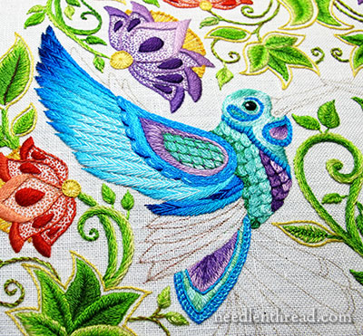
Here’s the wing, more or less finished. Or perhaps it’s just the upper part of the wing? I’m not sure how you’d group the longer feathers directly under this area – are they also part of the wing? Are they part of the tail? Are they part of the body? (Probably not the latter…)
But it does make a difference, you see. If those feathers directly under the wing and above that already-embroidered tail bit are part of the wing, then they need to work with the wing somehow. They can’t be too far off.
I started embroidering in this area, but I think I’m going to do some frogging here!
For one thing, I bounded into this section without a lot of forethought.
I had a vague idea of colors and combinations I wanted to use, but beyond that, I hadn’t taxed the brain too much.
But, since I was stitching along happily and still had time left after finishing the top part of the wing there, I dashed into the next area.
So, what did I do wrong?
Well, right off the bat, I should have started with the lowest feather in this smaller section – the feather right above the stitched tail area. It would have made it much easier to overlap each feather as I worked upwards towards the wing. It would look a lot better in this section if those feathers (the stitches themselves) actually overlapped the ones below, lying on top of them.
But did I do that? Noooooooo….
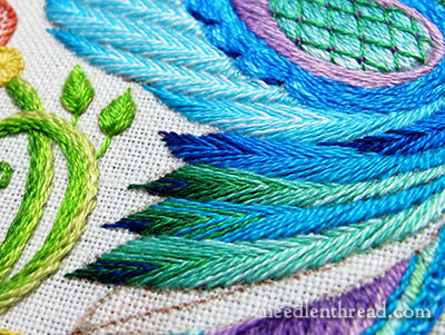
And, although I like the blue-green combinations at the tips, I’m not super-duper pleased with the whole arrangement here.
I don’t really like the little dark blue feather that’s inset right under the wing, either.
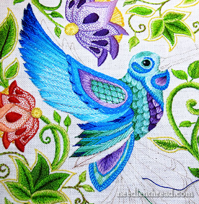
And I’m thinking about working the color & shade progression in the opposite directions in this area, too.
This part is a bit of a bafflement. Should I wait until I stitch the last feather above the tail, and then decide whether or not to pick the section out and start over? Should I just leave it and see if the area grows on me?
What do you think?
When I reach a dilemma like this, I usually step away from the work a little bit. I’ll take a break from it for a day or so and come back to it, with a fresh outlook.
Your questions, comments, & suggestions are most welcome! Have your say below!
If you’d like to follow along with the Secret Garden Hummingbirds project, you can find all the articles relating to this project arranged in chronological order in the Secret Garden Project Index.
I am really likin’ those scallops, Mary!
I am not a fan of the dark green. I like the dark blue for the tips, and then the green shading into blue. And yes, remove the dark blue from that spot under the wing – it doesn’t look right.
I do like the herringbone – it looks very nice.
Secret Garden, you commented if the lower portion was part of the tail or wing. In my humble opinion it is part of the wing. If you’ve ever seen a hummingbird in slow motion you can see how the wing moves. So I vote it’s part of the wing. The upper part is Beautiful
Thank you for your website and emails I never would have tried embroidery without you.
I don’t think it looks bad, Mrs. Corbet. I think you should leave it as it is and come back to it in a few days. If you still aren’t sure about it then, I would say to go ahead and pick it out and try something else.
Just my two cents!
Sarah 🙂
Good morning, Mrs. Corbet! May I say BRAVA, BRAVA to this lovely finish for the top wing! Your astounding neatness of stitching and the exquisite shading makes me want to weep tears of joy.
(Considering I’m going through a major health rut, you have no clue the amount of joy this blog and project gives me.)
However, I do agree with the need for frogging. the top part of the bottom wing is just too dark and clumpy. If I were you, I’d start with the brighter Turquois, and shade to the blue of the scallops. I’d also move that DIVINE EMERALD to the top-most feathers. Then, add it again at the very bottom.
Of course, I’d never presume to think that I know better than you! But I’m so excited to see what comes next. Please update us ASAP!
PS. Welcome to my fellow “new additions”
I agree with you..I think there needs to be a more gradual shading from the tip to the inner wing. Under the wing..the one tip end looks out of place. I think the darker blue at the top of the lower wing is good to separate it from the top wing. The gradual shading of the upper wing is great. The lower wing is just missing the middle shading from the dark tip to the lightest shade of the lower wing.
Beautiful, but I think there is enough blue how about more shades of green and purple with only a little blue for the lower wing. The dark blue in the upper wing does not look right. Enjoy watching your progress on this work of art. When finished I would like to hear how much time this piece has taken.
I agree, add some purple shades and maybe some lighter greens as well.
I agree that leaving it for a day or two, coming back with fresh eyes, is a great idea. You may find that you like it much better then.
I believe, like Nancy before me, that I would view the lower portion as part of the wing. My selection of colors would probably then be a continuation of the coloration of the upper portion. ( Which is gorgeous, by the way !) Just an opinion of course.
Thanks for the wonderful!!!!! website and all the resources that you provide for us.
Dear Mary
I don’t know, I like the colours you have used because they blend in with the rest of the design, I like the Fish Bone stitch you have used and your stitching is lovely. If you hadn’t mentioned your dilemma I would have said it is lovely as it is. I think you should leave it for a few days and reflect and decide then, whatever you decide I know it will be beautiful. Good Luck, thanks for sharing your thoughts on this project with us.
Regards Anita Simmance
HI Mary,
The upper wing is lovely. Beautiful job but you are right, the lower wing has too many colours and it lacks the flow of the upper wing. I would suggest you stick with the paler blues as you did for the upper wing and then darker at the tips. You can try introduce a tiny bit of green later if you think it needs it. Good luck!
A bird’s wing has two sets of 10 – the first ten longer feathers are called the primaries and the shorter feathers are called secondaries. Quite logical. And believe it or not, each feather is assigned a number 1 through 10 for identification purposes when damage has been done to the wing.
As for color, it varies from one species to another. Some have wing bars, patches, stripes, etc. Since your bird is not meant to be realistic, I’d say go with whatever you enjoy and looks right to you. In general the secondaries are not that exciting so you could keep it a bit simpler.
I do love the way you’ve been stitching the feathers.
It is just beautiful, no matter what you choose Mary
Dear Mrs. Corbet, the wing is absolutely lovely. I agree with you to let it be for a day or two and come back to it. My eye went straight to the green feather tips translating too dark, but it is just a first impression. In a day or two I amy look at it different.
Thank you for your generosity in sharing your working process!
Regards, Jackie
Mary, I think your bird is just beautiful but then you talked about changing it and now I don’t know. Your method of stepping back and giving it time to settle is a good tip. I am retired from banking and if I was working on a project that just wouldn’t balance I would walk away and come back to it, worked everytime and I have brought this theory into my needlework also.
Can’t wait to see what you decide.
Wait and see if you like it after doing the upper part. I think it is beautiful…wish I had your ability to shade things. Also, glad you are a fellow Kansan. Just goes to show that the central part of the U.S. has serious artists living there. I have been watching this item from conception and just love it.
Hi Mary,
I’ve been following your Hummingbird project
and your frustration with the feathers. At first, I thought long and short stitches would work, but I must say the “fish bone” stitch looks
awesome, so realistic. I love to stitch birds
especially by Trish Burr and will definitely use
this stitch.
Thanks for sharing,
Teri
Beautiful work! However, I would like to see the lower wing a blend of the blue and purple, rather than the green.
I’m wondering if having dark, both under the top wing and above the tail and shading light to the middle would work? Otherwise, I think shading to continue from the top wing part and continue with light, going to dark at the top of the tail. In either case, maybe that little odd feather at the top-lower wing against the body, should be light to be part of the upper wing, and not part of the lower one at all.
I’m sure whatever you decide will be beautiful!
You shaded the top feathers so fine. And you shaded the lower green ones but made the blue ones too dark. No light shading like the green. And the little death we sticking out should be light too – maybe.
Keep this photo to remind us what it looked like before and after please.
I think your humming bird is beautiful. You wrote about whether those feathers in question are part of the body or wing or tail. Just based on the chickens I raise, I think those feathers are actually part of the body. If that is the case, do you think they should be a continuation of the colors of the chest area…the pale turqois (how do you spell that?) with green tips? No matter what you decide for this area, I know it will be beautiful. Thank you again for all the lessons, tips, and advice you have given us all. You are my embroidery hero!
Ooh … I’m loving the top part of the wing! That looks beautiful. I think you are right that there’s something not quite right with the deeper blues in lower wing although I like the touches of darker green. I’m wondering how it would look if you chose the lighter shades of blue and mint shading into the slightly darker greens. I do quite like the dark blue tips … hmmm … I can see it is very tricky getting the colours just right. Looking forward to seeing what you choose when you’ve had a well-deserved break! 🙂
“When I reach a dilemma like this, I usually step away from the work a little bit. I’ll take a break from it for a day or so and come back to it, with a fresh outlook.”
Well, that was just what I was going to suggest. I think it looks fine, by the way. Even though you started working the lower feathers last, the ‘Feather stitch’ (correct?) gives it enough depth where one can’t notice it. If it were silk shading, perhaps you would be in trouble.
Mary the bird looks beautiful
You have inspired me to start embroidery all over again.
The blue and green look amazing
I have to say that I’m not wild about the green. To me, it’s a bit too glaringly different from the blues above. Or maybe it’s that the more “solid” seeming feather immediately below the upper wing is too much of a contrast and appears to draw a thick line before you see the herringbone stitch start up again in the green area. I don’t think you need to frog the green feathers, if you decide to keep those colours, but maybe do something with the harsh solid blue feather.
I’ve never posted before but have followed in awe! I agree with you that the little dark blue feather is not quite right, but how to fix it? No idea! Love Zilpa
I think you need to step back and take that break. The upper wing is beautiful, really lovely, but the lower wing should probably come out. It doesn’t have the smooth gradations of the upper wing and doesn’t flow as well. Because the secondary feathers are so much shorter, they should also be simpler. Perhaps emphasizing the mid-range of the colors rather than the darkest and lightest colors would work.
Hi Mary
I haven’t read any other comments yet, so I don’t know if anyone else agrees with me, but I think those feathers under the wing actually *are* part of the bird’s body. I think they’re the feathers on his belly.
Thanks so much for all your hard work for us. You’re generous to share your time and thoughts. In fact, you’ve inspired me to (try to, at least) learn to embroider. When I saw your review of the book Simply Samplers, I thought “finally, a real beginner’s book.” So wish me luck!
I’ve been following this project from the beginning. When you first brought up the possibilities for the bird colors, I thought, no way would this work. Too much, too many different colors all in a jumble. Doesn’t go together. Hurts. Then you began include purple in with the blue/blue-greens for the birds. I thought “maybe” and continued to observe. Now, OMG, it looks beautiful. If that had been mine earlier, I would have become frustrated too early and started over. But that’s why you are so successful at what you do and why I often abandon a project before exhausting all the options. I won’t go on. Just wanted to say that all the colors really sing harmoniously together. I love it. Hope this one gets framed extra special.
Lookin good in general
I think the little feather under the wing needs to be pale – it is not a feature.
I also think the other feathers should be on the paler rather than brighter colours maybe uwht darker tips but not as bright as the feature wing
I too like the blue green in those feathers and the way it complements the
scallpos but do not like the way you have done the dark blue of that first feather. I agree with starting from the bottom,I can see the difference but would not have thought of it untill you pointed it out. I would rip out and start from the bottom to see how it goes.
Love the green color. (MHO) Take the longest top feather out and add the green. The short top feather alternates to the lighter feather color but with the green instead of all blue. This comes from someone that is just learning surface embroidery thanks to you Mary. And it is not even worth two cents. 🙂 I am stitching this but it is not like yours at all. I can never just follow along. Hugs
Mary, I agree with you that there is something not quite right with the lower set of feathers you just finished. Starting with the bottom feather with the ones above laying on top of the one below will probably give a better result. The color choice should work out.
It seems those “secondary” feathers (thank you, Irene, for the lesson) would be the most “comfortable” if they mirrored the shading of the “primary” feathers. a smooth transition from light (bottom) to dark (top). I must admit that I am a bit intrigued with the idea of purple — but it might just be too much color jumping as the entire design already has so MUCH color in it…. my 2-cents!
You’re quite welcome. I’ve worked with injured and orphaned wildlife for over 20 years and have had to learn so many odd bits of information.
I must say it in my language: MARAVILHOSO! So beautiful, so well made…
Mary, I love what you have done with the upper wings. For the bottom ones, I would make them all more uniform and stick with the same group of darker blue colors like you have done at the top of that section. I love the contrast between the darker and lighter blues on the top and bottom section, that tie into the same color palette. I think the bottom section of what you have stitched is too busy with too many types of blues and greens. It looks striped and distracts from the rest of your gorgeous bird. JMHO.
In Christ,
Gail J.
Of course even ‘Real’ birds have various color patterns sometimes. Parrots and other large, easily seen birds have parts of their feathers distinctly different than others. I’m sure hummingbirds do too – but they are harder to see.
So you don’t have to worry about different colors, just whether the colors are pleasing to you.
Hi Mary ~ Of course, I think just about everything you stitch comes out amazing ! Your stitches are precise, your color choices are exquisite.
Although I have no interest in stitching this piece, there is still so much to learn from it. You are very inspiring.
I thought of you a few night ago when I was working on a bullion stem stitch ( each bullion took the place of one stitch ) It is a design I will be teaching.. After 4 -5 attempts and still not getting the perfect effect I wanted, I decided if I can’t get what I want, why should I expect the students to do it…I changed the stitch, which looks good.. I thought of you with all the ripping out and it made have a smile instead of getting frustrated…. Sharon
That’s just gorgeous. 🙂
I haven’t embroriderd for very long but I have spent my life sewing, painting, decorating basically using colors. I was pleased with the dark blue feather in the set of feathers under the wing. It naturally drew the eye in that direction. I might suggest on the last feather not to add blue and fade into greens only. The project is beautiful and something I enjoy learning about.
Thank You,
Jo
I thik the upper wing is beautiful. Possibly the half length feather is out of balance with the other colours
I’m really ejoyig this project evolve
Beth
Hi Mary,
I think the colors in this new section work well together, but perhaps if you reverse the order – start with the greener color and then the blue, which I think then ends on the greener color also, it might work better.
Beautiful work! I have trouble getting to my needlework once a week!
Well, I may be in the minority but I think that those feathers are part of the body. It looks like the shading should follow the colors used in the chest part of the body. Just my thoughts.
Hi Mary. Okay. First of all, it’s (he’s) gorgeous. My two cents, distributed as follows: LOVE the colors! The green and blues together are stunning. I agree with reversing the order, though, to have the body colors seem to radiate into the wing area. Also, hummingbirds seem almost reflective, so the body might affect the wing color. I know it’s not a realistic representation, but the wing movement, like a butterfly, is more undulating so the wing (it is the wing, BTW) should appear darker in the center. That being said, I would ADD some hints of dark blue to the bottom of the “upper” wing to transition into the more recessed area. Oh yeah, I also agree that the feathers should be started at the bottom.
I had just finished reading the “Birds & Blooms” magazine, June/July 2014, which was on hummingbirds. The part you are now stitching, or frogging, is part of the tail.
I think you should finish the last feather, let it set 24 hours, then decide if it is good enough or not.
on my best my very best day i could never come close to your embroidery. magnificent job. just love to look at your work. it always looks so perfect like a machine stitched it.
Hi Mary, I looked at for hints and I think the original artist used a little artistic license there. The area in which you question looks like it should be the body, not another set or extension of wings. ?? Conundrum – embroider it as is or use your own artistic skills to redo the image? I love the overall colors – my favorites, and his eye is just great.
I don’t see how those lower feathers can be part of the wing – visually they are an extension of the body. The original illustration is not realistic – they aren’t drawn as body-feathers – but for choosing colours and shading I’d treat them as body. In which case the green is spot-on – but so is stepping away for a day or so so you can look at it with fresh eyes.
I went back to see the full design and study the whole bird. It’s a hummingbird in flight, not perching. Therefore, I think the artist is trying to convey the blurring of the wing as it moves. The pointed oval just below is probably intended to be the feathers at the top of the tail underneath which the tail flares out in flight. The tail is folded out of sight when perching. We see these amazing little birds at our hummingbird feeder all day, and this (rather long-winded, sorry) explanation is the closest I come to fitting the facts to the artist’s fantasy, or is it the fantasy to the facts? Your website is a Godsend, as I am a rank beginner.
Dear Mary
I love the blues and greens you have used. I agree that top feather on bottom section of wing is too dark and the idea of changing the order of colour progression is a great one. but I agree wait a few days and sleep on it! I just love what you do and can’t wait to progress to the birds in my Secret Garden embroidery!
Jude
I think its looking good but I think your idea of reversing the colour changes would balance it better I wonder if any one is doing it in another combination of colours. It would be interesting to see. But definately a TOUR de FORCE!!! Good on you
I hope this project will be accessible after the first of the year, because I just sent the Amazon link for the book to Santa tonight. Can hardly wait to begin.
I’d say go darker since this project needs some darker values added. This is the part of the wing that isn’t particularly colorful in real life so having it be the darker shades with highlight of the colors above makes sense to me. The current colors give too much of a stripe look and take away from the upper wings.
I stare at a rather non descript hummingbird when I am eating and it could use some of your color flare!
Dear Mary, I just LOVE your work & really appreciate the fact that you don’t hesitate to unpick what you don’t like. Yes, I would have started the wing from below although what you have done looks fine to me. Why not work on the 2nd wing feathers at the top & then look at the overall effect before you undo any wing embroidery? I’m constantly amazed at how much you get done – real inspiration. Patricia.
Hello Mary.
I like it and think that the colour scheme is working out well. Adding the dark green grounds the bird and gives it some ‘body’. I do not think that is quite the word I was looking for but it will have to do. I would like to see more of the dark green in those lower feathers.
Nice job. Wishing you a happy weekend (stitching?)
Ann B
First, it’s beautiful. The decision about that orphan section might be easier to make after you’ve designed and completed the other wing. My guess is it will become clear to you what to do then. Don’t frog until you do that.
The more I look at the lower-wing the more I think you might omit the “blue blues” entirely and use the turquoises in the breast and head along with the Emerald.
I say leave the section under the wing in for some time. Sometimes our first instincts are the best. But then it has a chance to grow or ferment, one or the other. Personally, I rather like It. It sets itself off as not part of the wing. Let the viewer’s imagination decide what it is.
I love it like it is. Your work is so beautiful it’s like looking at a fine painting. If I ever get to the point that I can produce such beautiful work, I will have accomplished a master piece. Thank you for sharing your talent and work with all of us.
Thank you for sharing this; it is exquisite! I’ve loved watching this “fill up,” and am anticipating the finished product. I am just in awe of the even-ness of your stitches and how well you are able to cover the lines. I may have to try embroidery again — your stitching & colors are so tempting!
Hmmm…You’re right about those raggedy blue patches not really working. I’m liking the idea of reversing the shade from the body to the tips of those lower feathers – and I do like the use of the deep blue-greens, But then again, something entirely different (a flash of magenta or ruby perhaps??) might also be in order – somewhere down under? Maybe on the tail feathers? All in all though, this project is really looking good right now.
Mary, while I prefer the darker blue color, I agree that it is too much just under the wing, and I would try reversing those colors
I was searching away on google for embroidery techniques etc. and by chance came across your wonderful sight. A whole new world of embroidery stitches have been opened up to me and am now stitching away with vengence….. trying to make up for lost time, though I know this is not possible, it is wonderful to feel like an excited child again. I have started a new project which will take a year or more, but every stitch is an absolute pleasure… thank you so much.
So glad you’re enjoying Needle ‘n Thread, Anette!
I like it – I think the colours at the tip of the “underwing” balance the bird’s chest
Hi Mary,
It’s looking beautiful, but I think your idea of stitching these feathers in reverse colour progression starting with the green next to the body, might look better. It will pick up the green in the body adjacent and the colours and feathers will flow out wards.
Virginia
I think it is definitely the wing. I think you have great colors here but I would say in the wrong order. You have top to bottom, dk blue to greens. I would flip that. Dk blues at the bottom working towards greens to mint at the top. I would even say the two lowest feathers on the upper wing should be redone and shaded with the dk blue/black wash just above the newly minted feathers on the lower wing to give it that 3-D pop. Great contrast with this. The last undone lower wing feather should have strength with purple and black. Also, on the upper wing, the outside of the blue paisley eye, see how you have the darker scallop edging? Love that. You need to incorporate that effect into that lower edge all the way up to the green body feathers to make it look real. Right now it looks flat in that one spot. It just looks so gorgeous! So many of my favorite colors. Love, love, love it!
Keep it!! I love what you have done already. Twere me, I would finish it and keep all of what is already finished. It is truly gorgeous. Your perfectionism is showing! I rethink myself frequently causing a lot of needless work – sound familiar?
Appears to be the right wing, followed by the lower edge of the left wing, then the tail. Beautiful.
Hi there. I had forgotten that you were the one thread painting the hummingbirds from the book The Secret Garden. It is the whole reason I started coloring. I was a blogger from the blog Come Color with Sarah Beth on Blogger.com I found that coloring book shortly after!! And I fell in love with artwork. I am now just learning how to do embroidery with the hopes of learning stumpwork and thread painting. You are such an inspiration to so many!!!
Thanks, Sarah Beth! 🙂