


Happy New Year’s Eve, folks! It’s the last day of 2014, and I have something Very Important to Say.
Are you ready?
Because this is really going to come as a shock, I’m sure…
I didn’t finish either embroidery project that I wanted to finish by year’s end – namely, the Hungarian Redwork Runner or the Secret Garden Hummingbirds.
If you’re just joining us on Needle ‘n Thread, these are two projects that have been ongoing for a while, and back in November (or was it the end of October?) I entertained some silly nonsensical dream about getting them both finished before Christmas.
And then I took off on a completely different embroidery project, which is halfway typical of me.
(Any distraction will do, when it comes to my propensity for procrastination!)
But… to make today’s article a little more exciting, I’d like to stir up some serious controversy.
You see, I did something different on the second hummingbird.
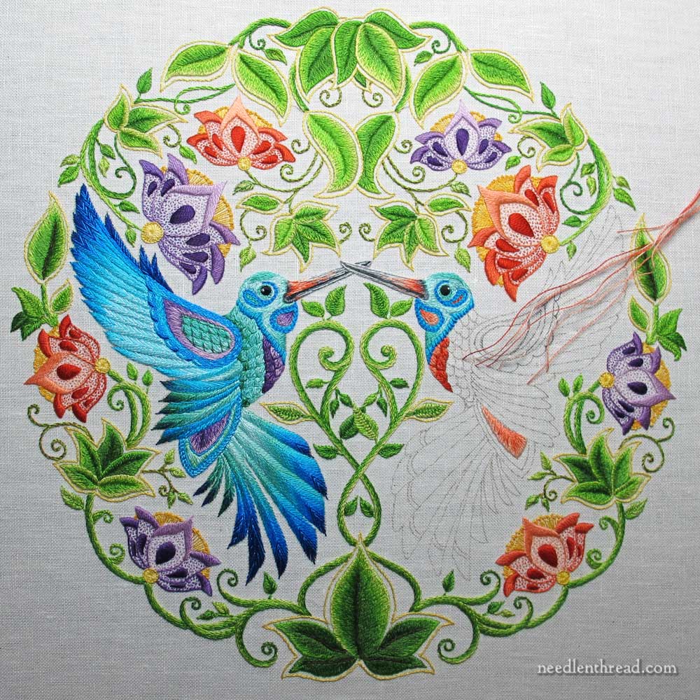
I was stitching away on the hummingbirds, perfectly content that one would mirror the other in thread colors and embroidery stitch choices, when…
…when the Hungarian Redwork Runner crossed wires in my head, and I figured, Why Not Red?
See, originally, I didn’t think the reds would go so well with the blues of the birds, because the reds are definitely warm and the blues are definitely not.
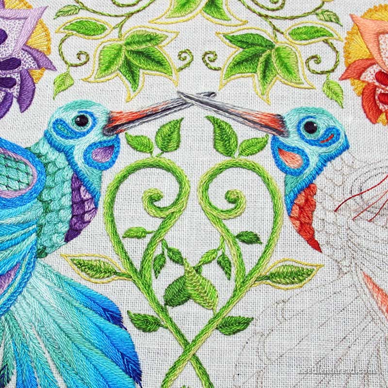
You know, I like the red!
I like it better than the purple. It zings with a zinginess the purple hasn’t got.
(You can click on those photos for much larger versions, by the way…)
Now, I know that, in the scheme of All Things Controversial in This World we Live In, color choices on an embroidery project probably don’t rank too high, but since that’s as far as we go on Needle ‘n Thread with controversy, what’s your opinion on the red vs. the purple?
Does it work? Or is this just me, letting my infatuation with the color red seep into places where it doesn’t belong?
I was So Very Happy to be back to embroidering the hummingbirds! Although the feathers take a bit of time to stitch, the end is much closer than it was. And I would like to finish this project soon.
I have another project lined up for January, and a long term project for 2015 that I need to get going on, but with that hummer hovering over me, flitting about in its unfinished nakedness (after all, it’s almost January and very cold out), I’m a bit reluctant to plow on with another project. What to do, what to do…
So, what’s your opinion? Yes or no on the reds?
And what should I do? Plow forward with my January plans, or concentrate wholeheartedly on the hummingbirds and get them finished? What would you do?
Feel free to weigh in on these grave controversies below!
Tomorrow, we’ll glance backwards over 2014 and I’ll let you in on some plans for my needle and thread during 2015.
Wishing you a safe, relaxing, peaceful last-day-of-2014, wherever you are!
Definitely the reds! They pop and bring out the blues. Your so close to the finish line on the hummers. I’d stick with them until done, but starting 2015 with a new project is enticing, so many do both!
I like the red and I like that the birds are different from one another. I particularly like that you’ve used the red in the face of the second bird – pulls it all together.
Mary, I would like you to finish the hummingbirds as I am panting to see the finished project. However, if your inspiration leads you in another direction, it would be no good. Blessings, Charlotte
Mary,
I have to say I like the red colour, but not so close to the 2 red flowers on that side. I have a feeling that the bird and the flowers will just merge together. I think it really does need the contrast of the blues, even though as colour shades like the reds better. I am not a ‘blue’ person!
Just looked and there are purple-blue flowers above and below the completed blue hummingbird. Could it be a ying/yang mirror image with blue’s on one side and reds on the other?
A red hummingbird sounds fabulous, go for it. Happy New Year to you!
The red looks super! Great colour choice and it’s adding a lot now that the birds will be different.
Love the red and I like that the birds aren’t a perfect match. I’m a fairly new follower and look forward to the embroidery news of the day.
Really like the red which picks up the red flower above the bird. Personally, I’d redo the head in red tones (instead of blue), but that’s probably just me!
I rather like this idea too. The left side is all blue/purples so the right side should be all red/oranges, imho. Doing a repeat of the left one would look good but changing the colours completely would be totally unexpected and quite awesome I think.
I totally agree with both of the comments already submitted – we have a lot of the reds/oranges here in Charleston.
I like the balance with the reds. One reason it works is because you matched the purple flower on the left with the purple in the bird. You varied the rest of your design and have an orange/red flower on the right. So why not have the bird on the right match that? At least so far, looks good. And a bonus is that you can enjoy stitching the second bird. I like surprises and always find it more fun to do a little twist on a design so that I’m not just repeating the same thing over and over. That gets tedious. This should put more fun into the design in terms of your stitching and the eye appeal and fun of the viewer. I love color problems/solutions. As to which you should finish first, do what feels good.
bonjour
cette broderie est magnifique
serais t-il possible de savoir ou l’on peut se procurer le modèle
merci d’avance
bonne année
catherine
La modele est du livre discute’ dans cette poste:
https://needlenthread.wpengine.com/2013/12/this-is-not-an-embroidery-book-or-is-it.html
merci beaucoup
Mary – The reds are beautiful! I wish, however, that there would be some magical way to put the red breast on the left bird and the blue on the right. It has to do with the flowers behind each one. But then again, it is beautiful the way it is. I’ve never known anyone with as much patience and skill combined as you have.
Happy New Year, dear one! All the best in 2015!
I would leave the purple as it mirrors the purple flower above and continue with the red as there is a red flower above his head. It’s very beautiful!
I like the red as well it is much warmer!
What you should do is get on and finish it but with best intentions I expect you can’t resist starting something new ha! Ha!
Many best wishes for a Happy Healthy Stitching New Year
Regards
Lynda
Il y a quelques semaines j’aurais dit “bleu” mais maintenant je dis oui pour le rouge ! Surtout après avoir retourché les couleurs des becs !
Et si je me permettais d’être à ta place, je terminerais the secret garden avant de commencer autre chose. Il faut ranger les choses et les classer pour que l’esprit soit bien libre ! (rire !)
Bonne fin d’année
Just love love the red and the way the birds tend to match the big flower just above their bodies !! Mary, you are a STAR!!!!
Hmmm. I’m staring at it again, as if it were my own piece (don’t I wish). Now I’m wondering if you shouldn’t be careful to not have one side so entirely red. You used purple on the left bird breast to go with the purple flowers, but then blue for the remainder of the bird. Now you’re using red for the breast on the right to go with the red/orange flowers. But I’m concerned now that you be sure not to blend too closely to those flower colors for the remainder of the bird. Dark red? Maroon? Or does that start a whole new look that won’t go with the piece. More time to think about it would be required for me. I’d probably stack up a pile of red colors on the bird and then look at it for a while. Then go back to blue, and everything in between. But I’m sure it will work whatever you decide.
Personally, I think I would have stuck with the purple. I find that my eye craves symmetry, & I think a project like this one calls for symmetry.
As for your other dilemma…what about letting yourself do the prep work for at least one of your new 2015 projects, but refrain from beginning the actual stitching until the hummingbirds are finished? …kinda the best of both worlds that way.
Happy New Year to you & yours, Mary…& to all of your readers.
I really like that the colors of the hummingbirds’ breast feathers echo the color of the large flower over each of them, so in my humble opinion, keep one bird cool, and the other bird warm.
I weigh in toward the red side, it adds to the piece One need not have perfect balance of colors. The finished effect will be an eye pleasing pleasing jumps from bird to bird will keep viewer looking at your art work.
I also love the red. After all there is no two hummingbirds the same. They all differ in some way. Just like people. If your like me Mary I say
I’m going to just do this project to the end it just
doesn’t seem to work I see something else and I just have to get another project on the go. No wonder we have UFO’s . Anxious to see these hummingbirds finished it is going to be gorgeous.
Happy New Year Mary.
I love the red and love the purple, hope you are not planning on changing the purple out but making the birds each different. I think it is a beautiful and striking contrast. Also it is nice to hear that someone else has more than one project going at the same time and has not completed what one was hoping to have completed. Have a Happy Healthy and Safe New Year.
P.S. I love your web site and read it everyday. I am not always working on an embroidery project but yours is always so beautiful it inspires me to get busy on what ever I am working on.
Hi, Judy! Oh, no – I don’t plan to take the purple out – I PROMISE!!!!!!! 🙂 So glad you like Needle ‘n Thread!
I like the red, Mary!
finish the hummers —- you are so close! And finishing a bit long project like that is always so satisfying, and you can get inspiration for the next projects.
Healthy, Peaceful, Happy and Beautiful 2015 to You, Dear Mary!
…yes: it is my opinion that if you have stitched the second hummingbird a different color from the first and even from the original plan, then that is how it needs to be. Color work of any kind is an intuition process. If one thinks of it, color does not even exist: it is mere refraction of light!
I am sure you will soon understand your own reasons for what you are now calling “controversy”. Just as you will treat yourself less harshly in saying you procrastinate: there is no place in my mind where I am able to accept a person such as you show yourself to be through the newsletters of Needle’n’Thread to be a “procrastinator”.
Thank you for all the wonderful and precious information you regularly share with us, your readers!
With love and appreciation,
Karin
PS. What would you like to concentrate on dear Mary?
Having problems with sending comment as parts are cut off 🙁
Maybe your plans for January would be just the break you need in order to finish the unfinished? 😉
Mary, I REALLY like the second hummingbird RED direction! After all, you’ve alternated the flowers between the cool purples and the warm coral tones, why not the birds! It may be a bit tricky to choose the shades of reds, but well worth it … so much more interesting!!! I say “Carry On and Stay Calm!” 🙂
Mary, I like the red, too. A lot. I’m wondering if you shouldn’t reverse which hummingbird has the red and which has the purple. Right now the purple bird has a lot of purple on its side of the project, and the red one is surrounded by a lot of red. The balance might be better if you reversed the colors. I’d suggest photoshopping or some other virtual technique before you start ripping!
Love the red. The poor bird must be feeling unloved and ignored being the only thing not finished in that whole garden. So finish the bird.
Chère Mary
Bravo pour le rouge du 2°colibri, j’aime beaucoup et ça ajoute davantage à votre projet.
J’ai tendance comme vous, a passer à autre chose sans que celle-ci soit terminée … Je crois que vous devriez terminer le jardin secret. En vous l’écrivant ça me donne envie d’en faire autant en ce qui concerne mes travaux d’aiguille et de dentelle.
Merci pour tout ce que vous faites. Micheonix
Go with the RED. After all one could be the male the other female.
Ooh, now that is an excellent idea!
My boyfriend and I both like the red, too.
Yes to the red!
Why?
1. Because you love it, that is reason enough.
2. There is an old adage in interior decoratingcredited to some famous interior designer, I can’t remember who, that “every room deserves a little red.”
Why not embroidery, too?
And there ARE warm colors in the embroidery in the flowers, it isn’t just about blues and purples and greens.
3. Who doesn’t love seeing ruby throated hummingbirds, at least here in the US?
4. By not having the two birds mirror images, it is more like two different, individual birds in love….and that’s why you didn’t finish the Secret Garden Project! You were waiting for St. Valentine’s Day! 🙂
I say be bold , go with the red. It’s fun to break out of the safe mold.
After finishing the hummingbird project , I’d like to do a project, but not quite as hard as Mr. Hummingbird. I had to quit because it was beyond my abilities.
Happy New Year Mary and everyone.
Continue with the red, can’t wait to see what you have for us in 2015. I traced the hummers in May but didn’t stitch anything now I want to start them and see if I can make some progress even if it’s a year late.
Oh, red!
I would stay with the purple, though I don’t mind the red, i think the purple is a richer look.
I would charge on to the January project, promising myself to devote one day a week to the hummingbirds (knowing full well that some weeks that wouldn’t happen). But that is why I have dozens of projects that are partially to mostly done and I still like enough to finish someday.
Love the red – red and purple do work together, just not always. And, like you, I wouldn’t have expected it to work here, but it is perfect – better than the mirror image would have been. You could start the new project, and then just surprise us, a little at a time, with your progress on the hummingbirds (since now you know we will be looking for them). But as Charlotte says, follow your inspiration!
Love the hummers and can’t wait to see them finished. I’m in a purple frame of mind these days but the red is very pretty so I won’t be able to help you make that decision. Sorry.
As far as finishing it before starting something new…..Here’s how I see it…..
The minute your email hits my in box, whether you like it or not, you have entered my world. In my world “It’s all about ME” and everyone else’s UFO list must be longer than mine. I just made my list this morning and I have to believe you need to add some more to yours in order to meet the requirements in my world. So shelf the hummers, the table runner and unstitch some of the ornament you just did. Put them all on the list!
Happy New Year!
I love the red with the blue. And I like that the birds are different.
What I would do and what I should so are usually different. LOL. I think it would be good to see the hummingbirds finished. 🙂
Oh yes! The red is lovely! I like both of the birds – each bringing in the floral colors so nicely.
Hi Mary,
I love both the red and purple. I would leave both to add a little variety and it ties in with the flowers nicely.
Love your blog and enjoy seeing all you are stitching.
Chris
Your work is gorgeous! I loved it with the purple, but now seeing the red, I love that even more, it really does pop the colors. You are inspiring me to consider attempting embroidery again…
You’ve got touches of red in the borders so I can’t see why it wouldn’t work.
I’m so glad to see the year end with you having things to carry over to the next year. I’m glad I’m not the only one to be in this boat.
LOVE AND HAPPY NEW YEAR!!!!!!
The red is terrific! I am glad that you decided to try that…it works for me!
Happy New Year!
Hi Mary,
Just gave some thought to your red question. While I love the red, I would stick with the blue for this reason. The piece is beautiful – very balanced and stylized, even formal. Tossing in red challenges the symmetry. 50 years from now will one wonder why the red. That could be good or it could lead to “did she run out of blue?”. That having been said, it is your piece and what do I know?? If you are still not sure, step away for a while. The embroidery police will not come knocking at your door.
Happy New Year.
Hi, Patty – Oh, no worries – the red will just be where the purple is on the opposite hummingbird. So the overall bird will be the same blues, but with red accents instead of purple. True about the embroidery police! 🙂
Go with the red. Purple if my favorite color than red. So as the poem goes “When I am an old woman I shall wear purple With a red hat etc…”
I was hoping you might do something completely different with the second hummingbird, maybe with no blue in it at all, but oranges and golds (not metallic) and a little red. I truly think you should finish the two projects on hand so we can all feel satisfied. I’d like to see that runner on a table, all hemmed and pressed and the hummingbirds in a frame. I have a hard time making myself finish projects so your following through would be a great inspiration to me, not to mention satisfying my curiosity about how they will look. I already have a box full of embroidered pieces that haven’t been framed, I know how that looks.
I actually love the change to red on the second hummingbird. Aside from the fact that I love red, too, I looked at the whole project colors from a distance and think that it would be a better balance than all blues and purples in the second bird. There seems to be a balance in the rest of the motif between the two schemes. I don’t think red exclusively would work, but combining the reds with some of the iridescent blues and purples would really bring it all together. Go for it. It sounds like a brilliant idea to use red.
I say finish the hummers! On the color choices, I go with my desires, not the designers. That said, I do not agree that the purple is second choice…it looks beautiful. But go with the red, otherwise it might look like twins getting lovey dovey!!! tee hee
I love the warm with the cool on the hummingbirds. As for which to do i.e. finish the birds or start your January project, I`d go with which ever your feeling when you are ready to start work on that morning.
Love to watch your work in progress.
LOVE THE RED! I was never really too keen on the shade of purple I thought it is a little too flat. This change is perfect!
The Reds. I think the Reds would really make the blue shine and add the touch you are looking for.
I love the red! I assume you are putting it where the purple is on the first hummer. You have reds in the beaks and in the flowers right above the hummer.
In the end you have to love it.
I love whatever you do so work on what your heart calls for. I am eager to see the hummers with this new twist.
Have a wonderful New Years.
Hi, Debbie – yes, that’s correct. Wherever you see purple accents in the first bird, you’ll see red / coral accents in the second bird, echoing the color of the flower just above the bird.
Different colored hummingbirds are lovely. I’m sure you have a plan for making this bird float above the flowered background as the blue one does. You’re embroidery is artistry!
I like the red. It contrasts well with the blue. Keep it up, I can’t wait to see it finished.
Definitely re Do!
I think the red looks splendid! Great idea!
I just recently found your site. It was love at first sight lol….My personal thoughts are that a piece of each of us should be in our work= GO RED, or to others do what makes you smile! Thank you for your insights.
I am so pleased to here that there is someone else here that just has to start new projects before the rest are finished. I am a fan of blues and purples saying that I think the red is going to work beautifully Thank you for an entertaining and informative web site. Wishing you a happy and prosperous New Year. Pippa
I like the red. Keep the other bird the way it is and make this one with the red accents. I am, however, wondering how it will look when it gets nearer to the apricot flower…
I like the red! It’s a little bit of a surprise with the purple on the left, but I like it.
Love, love, love the red. Reminds me of a ruby-throated hummingbird. The reds add spice to the piece.
Mary, I like the red. The blue/purple are making the finished bird feel “cold” and unfriendly. The contrast is a good idea and now I think you will be able to finish this project. Sometimes, I find, if I am not happy with a project just one color can make it impossible to move on and to finish.
Happy New Year!
Hello Mary,
go with the red! It brings up the whole work up – otherwise the blue and purple will bring only the red flowers up – and the birds will look like two purple/blue birds – sort of blah, despite the exquisite stitching.
I would finish the Secret Garden and the Hungarian embroidery before starting anything new.
That would give me the satisfaction of finishing two projects ,and starting three new ones – with all the joys of procrastination and adding a few smaller ones in the process…
Happy New Year to You and your loved ones!
Jakica
Love! Love ! Love !! The red! Would enjoy seeing it finished but understand. I also have many projects going at the same time and always ideas for new ones.
A very happy and healthy New Year to you ! I look forward to your blog every day ! It was a fabulous day when I found you!
Hi Mary…
I LOVE the reds!! I would leave the first one alone, and FINISH the second one in the reds. It will boost your spirit to complete the project. So what if the new project waits another two weeks?!!
Happy New Year!!
I think the red will be too similar to the adjacent flowers. It will leave the picture unbalanced if you do not change the purple hummingbird to match. If you do have both of them red then there will be too much red in the piece. Both are better with purple, in my opinion.
About that red, no, no, no! It’s great in small doses, as you have it with the flowers spotted around, but for most of the bird, aaargh! It will totally overwhelm the blue bird, and I don’t think you’ll like it, and you know what that means: rip it, rip it. The piece is so beautiful, too, and I think that if you use the blue again, you’ll be finished in no time, a state devoutly to be desired instead of having to re-do.
Hi, Victoria – Oh dear, I think perhaps I didn’t make it clear enough. The red contribution on the bird is as much as you see in the photos above, pretty much. If you look at the first bird, instead of the purple accents, the accents will be read. So the majority of the bird will be blue, like the other one. 🙂
Well, I like the red just fine. And please don’t smack me LOL but. . . . you see how there’s a large reddish flower and then a small purple one? with more red on the bird, I feel like leaning that direction. It’s so bright and seems unbalanced with the other bird in purples. Yes, the purple version has a large purple blossom on his side. But the red is so bright it’s just “red heavy” and I tilt. LOL I’m sure it will be perfect when done but I’m a maniac about balance. Passionate maniac about it. 🙂 Me – I probably would have reversed the colors in the birds, red to the left, purple to the right. Or more likely, they would have been mirror images.
Oh, I won’t smack you, Irene! I see the same thing, and retrospectively, that would have been the way to work it out – to reverse the birds (red the left, purple on the right).
But. But….But…… There’s just no way to reverse them now, without picking out all the purple on the left bird. So that was one of my points of hesitation. Fact is, I just don’t think I can bring myself to pick out one more section on this project. :-/
Well, I could pick out the reds and make them mirror images, without too much grief, I suppose.
But.
But…
But…..
I really like the red!
I was taught in a EGA glass that there is a theory that there is a poison color this is said that the color should never be included in your color choice. The color will pop and set your other colors up. Your red is a poison color that goes well with your color choice and makes the bird look great. So please stay with your red.
I would finish the project before going on to a new one.
Happy New year.
I think the red wins out! There is a bit of reddish colour on the beak and the red breast just enhances that. And the reds complement the blues better.
Definitely the warmer color. A painter called Hans Hoffman talks about the “push pull” of warm and cool colors bringing life to a painting. Josef Albers books might be more available in libraries.
Because design likes symmetrical work, you might keep most of the bird blue with parts of red. That would bring asymmetry while preserving the symmetry.
The problem the other commenter mentioned of the red next to the red flowers is also a concern. Not sure how you would overcome that.
Love the red
I would go for the humming birds and I love the red infusion! I find that UnFinished Objects,UFOs (do you have those in embroidery, I’m primarily an quilter), weigh in the back of my mind and make it hard to move forward. And I blame my procrastion on that… Good luck
I really like the red BUT I think it would look better on the bird which has been completed, whilst the purple should go on the right hand bird; thereby balancing the colours a little more. You already have large purple flowers above and below the left hummer, likewise red flowers on the right-hand side, so to swap the red detailing to the left and the purple detailing to the right on the birds might just equalise the whole. I shall be interested to see what you will do. Happy New Year!
Love red! You have red in the flowers too.
I love this piece.
I don’t like the reds. I think the purple looks beautiful and serene and the red looks garish but then that’s just me 😀
I started on your site in Oct so I fell in love when you were working on the blues. But red is my favorite color and I think would make for a greater finished look.
I think I have a million UFO’s so I would start the new. But, that’s just the way I am.
I’d need to see the picture of the whole hummingbird garden piece so far before having a good sense about the color of the ruby throat v. purple throat.
I agree with comment #10 – I really like the other bird being red. It adds a lot of interest to the project. And as I have 10 projects going at a time I say go for your new project – but finish the birds as I am really eager to see the end result – much more than seeing the red runner project done.
Cathou
Chercher en “archives”le livre est liste ausi les sources ou on peux le acheter
Happy new year to Mary and all your readers. Love the touches of red so the birds are not a perfect reflection of each other. Also, I am a great believer in interspersing small projects with work on a larger or more difficult one…the old “a change is as good as a rest “adage.
Love the red. Think you should go for it.
Wishing you a Happy New Year. Looking forward to your Blog in 2015. It is so helpful and full of information.
Thank you, also, for taking the time to answer questions we may have on projects we are doing.
You have to go with your heart on finishing what is started or go with something new. No fun to work on something “you have to”.
LOVE the reds!
I like the red. The colors of the flowers are balanced around the birds. Of course I am partial to red.
Finish the unfinished projects or they will weigh on your mind.
Carol b
If I were doing it and the January project could wait a while, I would forge ahead with the Hummingbird and use the red. It balances with the flower’s red and purple. Hope you can get them both done in January.
Love the red, it makes your eye look at each individual component of your exquisite piece. I vote to finish it before you start new project. Although I’m eager to see new project. Happy New Year.
Dianne
I just realized that you had changed the color on the 2nd bird when I enlarged the picture without readin the entire piece. I am anxious to see how this turns out. Get to stitching girl so we can see the result. Beautiful piece.
The red works. It fits in with the crossing-over of the flower colours on the two sides, and so ties the birds into the piece more firmly, while their blue makes them remain the focal points. Trust your intuition on this one.
I’m all for switching it up. Besides red being my favorite color, I don’t usually like to do the same thing Exactly the same way. They are two different birds-why not two different colors?
Whoops–I missed the first photo. And now think that red would mean too much red in the piece, with unbalanced birds (though I’d guess you are thinking of mirroring the breast color in both bords, and red breasts would be too much red even as bridges the gap in the until-now definite division of colors between the garden and the birds.
I admit this piece is not my favorite. The scallops on the breast never fail to jar me with their resemblance to scales, not feathers. I’ve been trying to keep my opinion to myself for months but out it comes. Sorry. I don’t think fiddling with the color of the breast is going to improve it for me. In the context of the piece, I’d find a greener bird with your red breast more pleasing, even though I LOVE the colors in the bird separate from the garden.
Love the red, plus for me even though it’s the same hummingbird with a different color it seems like a new stitching motif, plus I love red! We still have a couple of hummers here in Ojai, Calif. that we still feed over the winter…
Love your site! Read it every day, and your stitching videos are a big help to me! Thank you ! Thank you! Thank you! Also nice to hear, you have lots of projects in the works too! I have the same problem, as do my stitching friends…but I find its a nice problem to have. Last year I took the year to finish a lot of projects,I felt a real sense of accomplishment,and enjoyed the process and my finished works!
I think it was the red flower over the second hummer’s shoulder that led the charge to for the second bird to have red to maintain the purple/red balance present in the piece as a whole. The birds don’t need to be identical. There are many examples in the natural world of bird species displayimg differences in color indicating gender or maturity. And in your fantasy species of hummingbird, that is the way it is if you like it that way.
Love love the red, brilliant idea keep it going and a very happy New Year to you and yours. Really two identical birds are boring even if they are beautiful.
Love the red, beautiful punch of color. Great choice.
All the best in the New Year! Sher~Bear
Hi Mary
So far as you have gone I like it. Please get it finished and then we can see the effect that the warm colours makes – it already looks warm – mind you I also love red.
Joyce
Big YES on the reds. I think it will look wonderful with the warm colors on the adjacent flower. And I think you’ll feel more motivated on the 2015 project if you finish the hummingbirds first. You’re on a roll and momentum will carry you to the finish line in no time flat.
Sorry but I prefer the purple but then I am more of a fan of purple than I am of red. Start the new project the humming birds will still get finished as long as you don’t neglect them entirely. Sometimes a change is as good as a rest and when you return to them they will zip along a bit faster.
Aloha Mary,
Happy New Year to you and bravo for the reds !!
IMHO finish this project so it is off your head. Then start your 2015 project. Will it be a pain ? Probably but it beats having UFO on the shelf. That would really be a pain.
While helping my daughter paint her house, she stopped me and said, “Mom, if you start on something, finish it. Stop leaving everything half done and flitting off to do something else.”
I have taken that advice to heart and since returning home finished 3 projects. I do believe I will use that advice as my New Year’s resolution.
Doesn’t mean I am not tempted to…
Regards,
JI
I don’t usually comment but I want you to know that I really like the splash of color. I love the blue birds but the red makes it pop. Then, I am a lover of warm colors. Were you thinking of changing the purple on the first bird or one of each?
Jean
Hi, Jean – no, I wouldn’t change the purple on the opposite bird… Not at this point!
Just a suggestion: Perhaps you can change the flowers (or partially?) over the bird-brains? 🙂 My two cents.
i can think of two questions that I would ask. Do you like the red? If so, leave it. It is your piece. after all. How much red do you plan to use? If you stitch the whole bird in red, and it looks like that may be your intent, I think the balance of the piece will be upset. You will have a lot of red on one side and a lot or blue/purple on the other. Since one color is warm and the other is cool, their visual weight is different. The red is going to come forwsrd while the blues will receed. I think the piece will look unbalanced, and the red side is going to jump out at you. Yes, a little bit of red, or yellow, may help a piece, but too much can also hurt it. If you could flop the position of the two birds, which I know you cannot do at this point, the color would be in better balance. Good luck with your decision!
No, no – not the whole bird – just the accents, like the purple on the opposite bird.
Hello. Happy New Year! And I like your red. It counterbalances the purples. JMO of course!
I like the red, it balances nicely with the red flower, just as the purple side does.
To start the new project??…. If the itch is too great to ignore, then go for it.
Think I might do a little on the hummingbirds each day,to ease the conscience then give time to the new project. Give the creative urge the head.
I’m definitely a blue person, but I love the pop of red; the whole project is breathtakingly beautiful … gorgeous. I am in awe of your talents. Can I borrow your hands?
Sue
I love the red! It brings out the similar color in the piece. Also, I like the way the red hummingbird is in front of the blue. Red… the color of dominance. It’s wonderful!
I like the reds. They are much warmer tones and keeping the blue banding maintains the symmetry. Personally I would finish the birds before starting a new project. Those unfinished projects nag at me even when it is absolutely necessary to turn my attention elsewhere. Happy New Year, Mary, and thanks for sharing your knowledge and skill with us.
Hi Mary,
I’m a blue/green/purple fan myself but the reds are OK and since this is your embroidery project it’s your choice to pick the color scheme that works for you! If I were doing it I would definitely use the blue/green/purple shades but that’s just me.
Dolores in Michigan
PS-I always spend the month of January working on UFOs. I won’t allow myself to start a new project until Feb 1.
red hummer is great! I deviate from pre set patterns too!
Oh yes. But, then I would (virtually) flipflop the colors in the top two large flowers. I think that would make a better balance.
Oh well, what is done is done. You stitch like me a bit – I hate to plan to the end and like a different path to keep things interesting. Oh, and I rairly finish anything unless it is a gift.
J
The reds look great, so go for it. Also, I can’t wait to see it finished so, “git er done”. What will it be when completed? Framed art? Pillow cover?
Framed – I’m thinking a white frame with a colored mat, under bubble glass…
Dear Mary:
It has been a pleasure shearing my first year here on Needlenthread. I wish you a Very Happy New Year, not only in embroidery, on your own life too. You deserved this because you bring happiness to all of us who follows you.
Best wishes from Argentina…
Paula.
Thanks for your kind wishes, Paula! A happy New Year to you, too!
Love the red…clever to bring it in on the flower then down it the cheek and beyond..would be predictable to stay the same…new year, new colour! Wonderful stuff…
Love the red! But then…also love the purple. I say go with both to celebrate the wonderful variety of nature. Happy New Year!
It’s just beautiful. It’s been so very helpful to read through your progress and hiccups, and how you sort thru it all.
I say go for it with the reds. The purples on the other bird pull in the purple flowers. The reds on this bird will pull in the red flowers and make the whole piece work together.
I really like the red, but then, I’m always partial to red. Well, to purple too!
Finish the hummers; January is a long, cold month, and you will feel so happy to have a big project finished and can put all of your wonderfully creative efforts into the new project. Any hints?
Mary, my first thought was, do you want one hummingbird to “pop” more than the other? If you do, go for the red – it looks great. Happy New Year, Cheryl
I like the red.
I start huge projects and then wander off to something else. Sometimes this is necessary and sometimes not. However, I have come to the conclusion that 3 years is way to long to work on a wall hanging for my son. Therefore, I work a bit each evening. I will not go to bed until a small section is finished.
Perhaps this would work for you as well.
Whatever you decide, may God bless you generously in 2015. You have certainly been a blessing to me in 2014.
Short and simple.
Finish ‘The Secret Garden’ and
have both a purple and a red
hummingbird.
Sharon
I don’t want purple your hummer just said,
I love my breast all glowing in red.
Wait till my wings are feathered in blue,
Then you will see I am a beauty too.
We can’t be the same, that wouldn’t be right
But together we will be a glorious sight.
Just trust your instinct, you are never wrong,
We are waiting to sing a glorious song.
Some of the flock are waiting, their colours all differ.
Go take a look they are showing on flickr.
So come on Mary – get stitching quicker !!!
Can’t wait to see what you have in mind for 2015 – have a happy and healthy new year
Liz
Quite the clever little poet. Wish I had that talent.
I think this is one of the most exquisite things I’ve seen and am enjoying he experimentation. Regardless of what you decide to do, it will be exquisite!
Love, love, love the red. It’s s so warm and vibrant! And I like the contrast.
Beautiful stitching.
i thing mirroring is the way to go. Having the bird be red will cause the work to be visually heavy on that side.
What a conundrum Mary! While I’m very fond of the red, to my eye, it appears to tip the balance of your design to the right side. Can you test that theory, either by scanning the work & filling in the remaining colors digitally? Or by making a copy & coloring in the remainder with pencils? Even if it’s not a perfect match, it will give you a sense of the completed project. And it’s quicker & easier than stitching & ripping! Happy New Year & thanks for sharing your thoughts on your hummingbirds!!
A great choreographer once told me that true art is about balance and symmetry – and that the eye seeks this balance in defining beauty. I think you have achieved this symmetry by matching the birds to the flower above them. Thus one can enjoy the details of your beautiful stitches as well as the picture !
YES to the red!! It makes this piece sing. What an amazing zing it gives to an already beautiful piece.
Wow! It’s fabulous! I think it works well. But here comes the nit-picky part of me: I think it would work better if the bird colors were reversed! Not that I am advocating cutting out the purple and red and switching them, but because they are next to flowers that match them instead of contrasting, it will give the whole piece a ‘purple side/red side effect. But the red is smashing!
I like the red! I like how it complements the red in the flowers on that side of the picture while the purple lines up with the purple flowers on the other side.
Now, in terms of finishing it or starting something new…I like having several projects going at once but wouldn’t be nice to just hunker down and finish this one? It would be a nice finish to 2014 (even though it took a little bit of 2015 to get it done). And I think you might feel a whole range of happy emotions for doing so — joy, relief, pride, satisfaction , etc.
Whatever you decide though I look forward to keeping up with your progress.
Also, Valentine’s Day isn’t too far off. Maybe that would be a nice new target for the redwork runner?
Happy New Year Mary. I read your blog almost every morning and it’s a lovely way to start my day.
Cheers,
Jacquelyn
YES for the reds….Nice contrast and picks up the reds in the flowers.
Oh, Mary, definitely the red accents, then the birds will relate to all the colours in the rest of the embroidery. Beautiful!
Happy New Year to you and everyone. Hope 2015 is a good one, with lots of stitching done!
I love the purple look….the red will make a great contrast….remember the Red Hat Ladies use both colours to proclaim their fame and everyone stops to look at these lovely young souls. My humble opinion….they are proud to wear these two colours together….hope this helps. Happy New Year, and all the best for 2015
Happy New Year Mary! When I scrolled down to the secret Garden my eyes popped ! Wow! I love the red. Please keep it!
Sandra
Definitely work on what inspires you in the moment, and that seems to be the hummingbirds. As far as the red goes, my color theory background is telling me that a red hummingbird will make the piece unbalanced. Your enthusiasm and inspiration however, is telling me that your gut says “go red.” So “go red”‘ and see where it leads you. That’s what art is about.
Hummingbirds first; even though I’m behind because of Christmas. I love the red. A DIFFERENT COLOR SET WILL DEFINITELY (whoops) keep it interesting. I really want to finish the ornament too…which I just started!I’m so glad Christmas is over and I can do what I want to do!
I think the piece is absolutely beautiful. I think the red is nice, but there is a dramatic change at the bird’s head from the blue directly into the red. Are you planning to mix more blue and purple in the body of the bird? Would the bird in all reds, oranges, and yellows draw too much attention to that side of the piece? I generally am too afraid (or lazy) to make bold choices. I hate to rip out. I am looking forward to seeing how you finish the 2nd bird.
A far as starting new projects; well that is what the unfinished projects draw is for. It’s not the destination, it’s the enjoyment of the journey to get there.
Thank you for a wonderful site.
I love it. I too love red better than purple and I really like purple/ The hummingbirds outside my door flash red at times
I like the red. On the left side, the purple in the bird mimics the purple of the flowers on that side. On the right side, the red in the bird will mimic the red of the flowers on that side. I think the two similar, but different, sides will really pull the eye into the design. I just love the vibrant colors.
Being someone who loves color and is not afraid to put “whatever” colors together, I find that I like the red on the hummer–I think it balances out the blue.
I usually spend January trying to finish some of the projects of the previous year so they are not staring me in the face–calling out to me to finish them. Just my thoughts.
As an artis and instructor, I like the balance the red gives to the project. As a bird lover, I like the combination of both.
We have several species of real hummingbirds that frequent our area. the colors of the hummers in the piece invoke a day at the feeder.
I am not a fan of red as such,however I think the touches of red in the hummers make a better design choice, it seems to perk up the whole sampler as opposed to the cool spot of the other hummer.
What ever you decide your work is beautiful and the project quite wonderful.
Sammy W
Yes! It’s a definite with the red flowers on that side too.
Love the red! It keeps the balance that you have with the flowers alternating with the reds and purples. So as long as the rest of the bird is consistent and you just swap out the purples for the reds it will look quite spectacular.
i am partial to the red So go with he red. As someone else wrote it zings. Whichever you choose it will be beautiful. Yes love the rd
I like the *idea* of the red, and the fact that it brings the floral colors into the birds, but those warm flowers already dominate the cool purple ones. I’m afraid the red-accented bird will dominate and unbalance the whole piece. Then again, I’m much more a green-turquoise-purple person.
Sensibility says finish the hummingbirds first, BUT, isn’t it fun to start a new project! !!
The Reds are better. They make the bird pop.
It would be great to see the two projects finished, but it is always fun to start a new project. I have decided that I cannot start a new project in 2015 unless I finish one that is already started.
A popped bird? Sounds messy, but on one gut-busting level it “goes with” the red… (snicker) 🙂
Dear Mary, first of all, this is VERY important. Anything to do with thread and/or embroidery is of the utmost importance!!!!!! (in my book).
It reminds me of when my sister and I discuss nail polish colors.
At any rate, Mary, I too love love love red, especially that chain stich hungarian embroidered runner you are doing. yes i love red. But Mary,
no red for this work It just doesn’t go. Sorry. Purple — it needs purple or green or aqua or violet or blue — but not red.
I am sorry.
Lyn
I think the red works, it ties in the flowers.
AS to what to work on, I say do whatever pleases you. I once got very stern with myself and decided I wouldn’t work on anything else until I finished my knitted sheep. I stopped knitting for six months. As soon as I gave myself “permission” to work on other things, the sheep was finished in about three months. The brain is a weird place (or at least mine is 😉 )
Love both colors in my own life. However, I wonder if the head of the now red hummer should be less blues and more reds. Love the idea of the red hummer, and I’m confident that whatever you decide will be wonderful.
Definitely the red. But I’m a red person
Mary, I love the red! It draws my eye to the Orange and red tones in the flowers and to me is a perfect balance to the rest of the piece. Another vote for the warmth and vibrancy of the contrast! Thanks for your continued inspiration and sharing the decisions all of us face being creators!
Susan
I like the red and the contrast with the other hummingbird.
I would just do the throat in red-Ruby Throated Hummingbird. I think if you did too much more red all you would see is red and no design.
I would like to see you do the January project.
Go for the REDS!!! I love it, it makes the reds in the embroidery stand out and it looks really well with the blue hummer.
Unfortunately, I’m with you on the procrastinating thingy. So, if it were me, I’d go with a new project. Perhaps that would make up for the dreary weather outside. (if it’s any consolation to you we’re having dreary weather in FL this winter too–not that it compares to your weather but it’s really not normal for us.)
So, I vote for the red on the hummingbird and a new project. Also, could you publish the thread colors needed for the hummingbirds? The final list. See, I have the hummers all traced on tissue paper, most of the threads bought, labeled and organized but not one stitch done and I’m wanting you to publish a new project.
Thank you for your wonderful blog. Happy New Year to you and yours,
Maureen
I love the red! It brightens the bird and links the flower above to it.
I hope you will finish the humerus before starting the new project. I’m eager to see the piece completed. It’s such a lovely project.
Hi. I want you to be happy, but red after you complained about the redwork,
Dear Mary,As you no doubt have noticed the flowers above and below each bird are purple on one side and red on the other. I would have one red and one purple, male and female. I would either leave them the way they are or swap the purple and red over so they are in contrast to the nearest flowers above and below them.
Regards,
Jenny Wren
The red is very striking! I have many hummingbirds in my gardens and really like the red.
I like the red. It makes it look like the male hummingbird is courting the female one. In the bird world the male is always the flashiest. Keep going with what you have started.
We are woman – we can change our minds, right? We can even, perish the thought, be fickle. Now to answer the question(s) you pose….I am heartily on the side of blues and purples, but that’s primarily because they’re my favourite colours. Further, ALL colours go together in nature so therefore there’s no wrong way to go. Now I’ve seriously planted myself squarely in the centre of the fence, I have to say that I like the two different colours. The embroidery police aren’t about to get their knickers in a twist, so I say go with the difference and embrace it.
Regarding the second question – perhaps altering back and forth (one day, one week) between these projects and something new might be a thought. Hmmm….all this fence-sitting is probably going to lead to a largeish amount of slivers in my arse!! Happy New Year!
I’m quite familiar with your dilemma! First – I LOVE the reds – fits in with the rest of the design and really picks up the birds. Why should the flowers get all the attention? Then – I’d finish this. Once so close to the end it’s envigorating to know it can be finished – and do it. Tho i think I’d leave the table runner until perhaps June to finish – when this year’s project begins to pall. (If you want lessons in procrastination, just ask me – I’m the expert!)
The Hummingbirds are lovely! And it’s be so much fun following along with you….
I love the Reds! Just a thought, if everything else is mirror-image, will it bother you if the birds do not? I’m good with them being different because of the zing factor! Beautiful work and I love your humor! Happy, happy New Year!
Well, aside from anything else, you alternated reds and purples in the flowers, so doing the same in the birds just adds to the balance and rhythm of the piece. Claim it as an artistic decision on that ground!
And, yes, I do think the red works with the blues. I’d keep the purple for balance reasons, but by all means use red in the second bird! Besides, how many real birds are balanced according to DMC’s color wheel? That variation is part of what makes them so beautiful!
I’d really like to see more of the blue around the reds. While I like them right now, I’m not sure what more blue would do. Nothing like equivocating on an opinion, is there.
I started a new project Christmas Eve, and cam considering that to be me project to start 2015 with. I do have an ambitious year planned for myself … A Quaker Christmas, By The Sea, 5 ornaments for my grands, plus others for ornament exchanges in my guilds, A Year in Chalk, finish several old to the point of antique wip…and some ornaments for myself.
I think the reds will create an interesting balance in the piece if you continue to place it where you used the purple in the bird in the left. It picks up the other flowers and does imitate nature as well. I like the idea!
I love the warmer tones. A good juxtaposition to the blue. But even better I like the inspiration that came to you to use the red. Go with it and see where it leads you.
I definitely LOVE the red. I enjoy pieces that are not perfectly symmetrical in color as well as in content. Your eyes have more to look at and makes the piece more interesting.
Hi Mary,
I like the red more than the purple. I like the purple bird but I think it is too monochromatic in colour, which is absolutely fine, but it leaves the orange flowers out there on their own. Using the red gives the orange flowers a sense of belonging. I would finish the hummingbirds before starting a new project – you’ve done all the experimenting so it should be relatively quick to stitch the second bird. Besides, you don’t want to put it aside and then forget what you did and have to work it all out again!
Red is good. Finish it quickly! Susan in Cape Town
I felt the need to weigh in on “Go Reds!” The birds don’t have to be twins, as much as I like symmetry. One another light note, I can’t tell you how many smiles and chuckles your blog has brought me this year. I am still an “armchair needle worker” and the kind of voyeur who posts crafts projects on pinterest withe every intent of making them all- someday. Meanwhile, I’ll sit back and vicariously enjoy every word you write. Have a happy, healthy New Year!
Happy New Year! I hope it’s wonderful.
I really like the reds Keep going and get it finished … I’d really like to see more.
Red? I have two comments on that. One: Since mother nature is okay with red on her humming masterpieces, I will not quibble about that. 🙂
Two: The only person (unless it is a gift) who has to like it is you, and if blogger Mary is okay with red on her humming masterpieces, I will not quibble. 🙂
What would I do about the unfinished/new start? Personally, I would finish the red runner/blue hummer first, that way I would not have it weighing on me. Also, if the new start project has 12 months, I would be okay giving a month to finish up the runner.
Just my two cents. 🙂
I think the reds work well and I am not a red person. I would still leave bird as blue with red accents. Personally I do prefer the blue/purple bird but those are MY colors.
Happy New Year,Mary.
Oh yes, the red is the right color!
Hey, if you feel like starting a new project before you get the old project finished, I say go with the new and do not feel guilty about not finishing the old one first. They really will get finished. Your loyal viewers will love whatever you decide – just share with us.
Have a healthy, wealthy 2015. Thanks for all you do.
Fran
I love the red just as long as you also use the blue. You do have quite a bit of red on that side. Beautiful work. Love it.
I really like the red on the second hummingbird
and would love to see it finished (after all –
that poor bird is going to get mighty cold without his feathers).
I love your blog! I really look forward to it each day!! I like the reds on the second bird & I definitely think you should finish the old projects before moving on to new ones. I am looking forward to seeing the end results & it will be nice for you not to have them hanging over your head or tucked in the back of your mind nagging to be finished.
Deanna
Like the red but feel the balance will tilt with the large purple flower on the same side as the purple bird and the large red flower with the red bird. How about having the purple bird on the red flower side and the red bird on the purple flower side? Would mean ripping out something, though, and that is never enjoyable. Hm.m.m
Wow, I love the red. I think it brings all the project together. The purple is beautiful but sort of blah compared to the red. I’m assuming you will only change the purple to red. I love the rest of the birds coloring. I’m just a quilter but color choice is so important and I think you’ve made a change for the better.
I seem to be standing with the minority on this controversy. I think the red disturbs the balance of the piece, because it attracts the eye so strongly. I agree with the writer who suggested opposite positions would have given better balance to the piece.
However, I am assuming that you will be using the red only in those places that are purple in the first bird. Perhaps once the blue and green wing and tail feathers are in, it will calm the reds, and even out the balance again. A second softer red might also contribute to the calming effect.
I am looking forward to seeing what projects you tackle in 2015. Happy New Year!
YES – I love the reds in this second hummingbird! You mixed the flowers in a similar manner, so this does not appear inconsistent in the overall composure of the piece. So, I’d definitely say ‘keep going forward with it’!
Hi Mary!
First, best wishes for a happy and blessed New Year. I enjoy your daily-posts with my morning coffee; sends me off into my day in a cheerful mood thinking of colors and projects ‘to-be’. And I use your website frequently for reference for my projects or recommend it to others (I’m on several facebk groups that use embroidery for it’s self or costuming.)
Although the ”hummers” aren’t my favorite of your projects, I have enjoyed your process of color selection. Monitors being ‘all different’, I can’t really see if the reds your using are ‘yellow-gold’ toned or deeper (like a cranberry). My personal preference would be to use reds that have a blue undertone… I think yellow-toned reds next to all those lovely turquoise/purples will result in headache-inducing clashes. However, that is just my personal preference and difference in opinion is what makes life fun.
Thanks for all you do for ‘us’ (your “groupies”). I hope someday we can all have are own ‘beating around in the U.S. and meet face to face!
Best Wishes,
Cynthia
Yes, yes, yes to RED!!! Why be predictable and mirror the left side when you have already switched flower colors? Why not make this gorgeous piece really POP? I am so very glad to be in such good company re procrastination and switching to something a bit more enticing! Our brains need a break in order to have the time to come up with the “red ideas” . . .
Happy New Year to you and your family. I am very pleased that the birds will be non-identical — whatever colors you choose to use. With every aspect of the project being so beautifully mirrored, I agree that a little splash of reality is a good thing. Never are the hummingbirds at my feeder identical in color . . . love following this and your other projects.
As for “what to do” — I personally am excited to see what you do with this emb project — going to frame it? Pillow for a formal living room? Give it as a gift?
It is a joy to follow a master crafter like you. Wishing you the best of a RELAXED 2015. Bet you can’t even spell or feel that word 🙂
Go, lady, go! With much admiration from Texas!
Since I’m a finish-upper I’d vote that you finish it and go forth with a clean conscience to you next project. I love the reds for the hummingbird!
Oh, I love it! I really liked the purple version but I remember thinking that repeating the same colours with the second hummer wouldn’t be quite as interesting a journey. Not that I could have thought of the right ‘different’ colour-way to save my life! I love the red, I think the whole design is going to be so much more dynamic and interesting to look at when it’s complete. 🙂
I love the reds. But, I also love the purples. So you may as well do whatever you want since I’m no help at all!
Happy New Year from Brisbane where at 6amon 1.1.2015 it is hot and humid .the red compliments the blues and purples perfectly .
I like the red. Aren’t the male birds more colorful? So now you will have one female and one male hummingbird. I would probably start a new project but your birds are so pretty it would be a shame not to finish soon.
I love the red! I think having different colors for the hummers will give the piece a bit of excitement. I am not one to give anyone advice about what to do. I have a terrible case of startites!
I like the change in color and it mirrors the flower that sits above it, as the blue and purple does on the other side. Seems like a natural to me.
Red, red, red is the winner in my book and I am not even a lover of red. Over the years I have had to make myself use red instead of always my favorite colors, including purple and blues.
Procrastination is my middle name, so go for the new project and somewhere in between go back to those you have started.
Everyone have a Happy New Year
Yes I definitely like the red but my mathematical brain would swap the colours on the hummingbird breasts. The purple breast would be on the right and the red on the left. This balances with the red and purple flowers.
I love the red. The design is symmetrical so the different color gives it a touch of something that makes you think. Plus it echoes the flowers. Do you enjoy working on the hummers? If so you might need it for a break within the big project for 2015 (not that it is hard to find a smaller project for a break – you have so many great things like the Christmas ornament)
To me, if color is off, then everything is off. So careful attention color in whatever we chose to do in whatever craft we chose to do it in is critical. At first I blurted out to my computer screen — what’s the challenge? Play the red against the purple. But, when I studied the rest of the colors in the needlework, I saw that there was a definite pattern of playing a red flower on one side against a purple on the other. In the whole of things, this could become a bit boring. IMHO if I had to make the choice of how to stitch the second hummer, I would go for dueling rivals — same color — as what I might expect to see at my feeder. To my eye, same color (purple) would make a dramatic statement — that’s what it’s all about — the hummingbirds — not a repeated color pattern. But, again all this is IMHO! Sandy
I absolutely love him! Of course he’s the male, Mr Flashy Feathers! Put those red tints in the upper wing like where purple is in the other bird and I can’t wait to see what you will do for the tail feathers. You’ve already answered your question about what to do for January. You have to strike while the iron is hot. ‘Sides didn’t you just say you were so happy to start the birds again? Just ride the wave, girl. Woo hoo!
I love red! Not much you could do to a red bird that I wouldn’t like.
I really like the reds! They help the other colors pop. I think I’d go on with the plans for January. You can never have too many projects:-)
Keep them different. It adds interest. Like two friends, meeting at the nectar cooler.
I do prefer the red. Actually, the red in the beak of the left bird bothered me. By making the right bird red it works with the beak much better. I wonder if you will stick with the exact same blues in the rest of the hummer. I am anxious to see it develop.
I think the person who said to do the prep work only in the 2015 project has a great idea.
Love your website and love watching projects develop.
I like the red highlights very much.
I also just finished reading a book about procrastination. I learned that we procrastinators get A LOT accomplished by making “to-do” lists, and then doing a bunch of “smaller” things in order to avoid doing the “most important” thing. So having a lot of projects going at the same time is actually quite productive. We make the “less pressing” projects seem more fun by virtue of using them to avoid the “more pressing” ones. 😀
I LOVE red! Go for it. I say start your new project while the thought of it is so exciting. Don’t fight your instincts or emotions! Happy New Year to all!!
Fabulous Mary, looking at the overall it’s meant to be with the colour arrangements, do it now is my motto whilst you are hot with ideas.
Looking gorgeous. Happy New Year, love your articles, you are such a wealth of information and inspiration, thankyou.
Go for it Mary! Nature uses color with abandon when she can! Hummingbirds are such a perfect example of this theory, don’t you think? The blue and red are complementary to each other, they are opposites on the color wheel, so you are guaranteed colorplay! Happy Happy New Year Mary! Lisette from Oregon
HAHA, MAry. Now with #157/8 or so is your head spinning. Now we all are anxiously awaiting for your hummers to be completed. Go for it, red and all, just finish it please. I agree with someone that plan on your next do what you need to do to feel you are starting a new 2015 fun item, however do not start with a needle and thread till the hummers are DONE. HAHA
Love your site and I digest it every am. Very few times that I click off, you keep my interest there. PGH
I think the red ROCKS! After all, what’s the most common hummingbird in the US? The RUBY throated hummingbird! Either way, the birds are completely beautiful. Happy New Year!!
Why not indeed. I like the zinginess of it; it goes with the overall vibrancy and poppityness of the design. Nice to know the world isn’t coming to an end at midnight CST because your projects are unfinished. I would have ended the world as we know it ages ago if such things happened. Happy 2015.
Dear Mary,
Happy New Year!
May we all get our planned projects completed this year. At day one it’s OK to be highly optimistic!
I think the red looks great and balances the whole piece.
Louisa
Mary, your colour choices for this project have been perfect so far, even if some were arrived at after some experimentation. The red will be beautiful. It will mean that the colour balance is not symmetrical – more purple flowers on left to go with purple bird; more red on right to go with red bird – but why should it be symmmetrical? Why not have a cool / warm asymmetry?
Yes to the Reds! It will look great!
Only advice on starting new projects is to go ahead but then that’s the advice I give myself & why I have lots of WIPs!!
Happy New Year!
Ruby Throated Humming Bird! Go with the red Mary.
I love the reds! I love the purples! And they look great together too! Nice work, and thank you for sharing.
Hello Mary,
Love, love your website. I recommend the red because the color red you are using is the opposite color from the blue on the bird which makes the bird pop and more dramatic. Technically, the 2 colors are opposite of one another on the color wheel and that is why it is more dynamic. I work with color all of the time because of my background in interior design.
Happy New Year to you from Australia, it is 1/1/2015 here already. Looking at the flowers around the birds, the large purple flower goes with the purple and cool colours in the bird. On the other side the large flower is orange, yellow etc so I think you might get away with the red. If the red has a blue base rather than yellow i.e. not orangey red it could work. Would like to see more. You could cheat and colour one in on paper and lay it beside the purple?????
Sandy NSW Australia
I like the red but not on this bird . . Too close to the flower of same color. I think it will look too heavy on the right side of this piece. Would have been great on the bird to the left and the blue on the bird to the right.
I never would have thought about doing the second hummingbird in red but I actually think it is the better choice. It’s a great balance for the flowers. In the scheme of things it is uber important to all us thread junkies. Go with it!
First, let me say that I think the hummingbird project is lovely and your stitching is terrific. Red is a bold and beautiful color; and it demands center stage. With the red flowers and bird, I found my eye bouncing around as each piece of red grabbed my attention. The purple is more harmonious. I have to vote for purple for this project. I also love red!
Don’t have a prob with the reds but if you are concerned they are too far away in the family of colours from the blues and purples then a blue red could be chosen .However I do think the orange red will help both birds be noticed as it brings contrast to both. Finish the Hummingbirds before starting something new – this needs closure. Happy New year. PS love your FB page, use it all the time – thank you 🙂
Ooops I meant website – silly me
I like the red,moo for it!
Love the contrast of the red
It works!
Brilliant, Mary! You always seem to know just what to do with color. The reds in the second hummer keep the eye moving around the piece, and that’s just what one has to do to observe hummers! Lovely choices.
I really like the way the purple bird and red bird contrast and how that flows with the alternating red and purple flowers. Please finish it. There is less than a third to go, and you will have all the satisfaction of having done it before the next project (and hopefully let us all see how great it looks done!) Nothing satisfies the way a finished embroidery project does!
Definitely go further with the red, and by all means, “git her done.” I’m in the same position with too many UFOs. I buy my patterns kitted out as I don’t have a good needlework shop in this area of WV;I vow in 2015 not to buy another kit. I love your daily column, Mary. Happy 2015 stitching to you and all fellow stitchers.
Carolyn
I am not an expert as I am sure some of the people on this site are, but I love the red. As for finishing what you have started, that is a hard one for I have several thing in that state. But it is always so much fun to start something new -right. Go with what your heart tells, you can’t go wrong there.And while I am here thanks for your site I just love it.
Absolutely yes on the red. If it’s good enough for Mother Nature …
Happy New Year, Mary! Looking forward to another year of your lovely blog.
Now mary, my similar propensity for starting new things gets me into a lot of trouble, like it has you, but I often wonder, if- if- I did obey the creative police and not start new projects until old ones were finished – would I actually still produce as much and be as creative? For me, I think that first enthusiasm of starting a project is not the same if I simply record it and put it in a queue. When I come back to it, it doesn’t have the same enthusiasm attached and so will take even longer to finish.
So the long and short of it for me is that it is better to go with your enthusiasm for a new project, and remember that everything doesn’t have to be finished this moment. Indeed it is not the product but the PROCESS that sustains us AND KEEPS US STITCHING
I think it looks good. Reminds me of turquoise and coral. You wouldn’t think they would go together but somehow they do.
Love it! Especially as the red flowers are closer to that bird and the purple flowers are closest to the purple bird. Looks to me like a perfect design.
Happy New Year to you all.
Happy New Year. I quite like your second bird, I picture this one
As the male! I like the way it brings the color from the flowers down
Into me of the birds. I have a number of projects in the works, but am
Sitting here deciding what to start tomorrow, as I always start a New
Project on New Years Day. So, my vote is to go ahead and start a
New project. Thank you for a year of wonderful blogs. Happy
stitching!!!!
Yay for red – initially I thought NOoooooooo, but then I realised that the red bird will be under the red/orange flower, as the blue bird is under the pruple/blue flower, and it will still be symmetrical in it’s own random way :-). And yes, finish it, please.
Blessings
Maxine
I think the reds may be stunning. I love your needle bit, it is just like mine. Needles, needles everywhere. I can’t identify most of mine so they just sit there staring at me :C.
Happy New year, Mary. I appreciate all you share with us with such generosity. I have learned so much from you and could spend hours in “stitches”.
i don’t like the red:( In general I love red and dislike purple, but I like the purple here. I, however, am always surprised how much I like your finished pieces, even when I don’t think I like how they are coming together. Blue and orange are complimentary colors, so it will likely pull together beautifully.
Most definitely the red! New Year, new project! Why limit yourself?
Happy New Year!
I love the red and the purple on the birds! I have seen so many hummers in these colors flitting about. I do like that they are not mirror images, because that would be a little boring.
Happy New Year, my muse!
The red looks wonderful. Not all hummingbirds are the same, far from it. So the variety is very pleasing. And, there is other red in the flowers. Good job!
Now, whether to start a new project for January or finish the two projects in WIP status (wok in progress)
The red looks wonderful. Not all hummingbirds are the same, far from it. So the variety is very pleasing. And, there is other red in the flowers. Good job!
Now, whether to start a new project for January or finish the two projects in WIP status (wok in progress)
In nature no two things are a like. I like the introduction of the red. The other thought is blue and red make purple so you really can’t go too wrong. I believe the balance between the colors are what will really make the difference in the addition of the red. The first thing that caught my eye was the red and I was drawn to the red in the flowers. So keep on with your red.
Reds are nice and do add some zing.
Start the long-term 2015 project and work on the hummers 30 minutes a day.
Hi Mary
Happy New Year.
As I love colour I would swap for the red but leave the purple where it is on the other bird – I like the contrast and the “surprise” in finding the birds different colours.
Not being too much of a procrastinator I would definitely finish the Secret Garden Hummingbirds – what can you lose except sleep but at least once finished it will be out of your head and you can start afresh for 2015 – notwithstanding your hovering Hungarian piece.
Good luck and thank you for a down-to-earth enjoyable site. Cheers, Helen
I like the red!
I like to finish a project before starting another but I don’t always follow my own rule!! Temptation and the lure of the new wins especially if I am bogged down.
I am looking forward to the projects 2015 brings.
I really like the red . I would finish the hummers to keep them out of my UFO box, but I assume that you are much more disciplined that I am.
Will the biggest part of the bird be the same blues as the twin? If so, I like the red idea. It mirrors the flowers in the outer borders and makes the eye flow through the piece.
Let me add to my comments. I think people are reading “RED” and seeing Santa red when the colors you have used so far on the second bird are the same “reds” that you’ve used throughout the project. As long as you will be using the same blues on both birds, I think the “red” accents in the same places as the purple on the first bird will be perfection! Again, it will make the eye move throughout the whole piece.
Go with the red looks dynamite with the blue and purple.
Finish this project and then move on to bigger and better in 2015.
Definitely the red
Hi Mary
I read your emails every day, wonderful creativity and enjoy seeing what you are making. Very inspiring – I want to make the hungarian red work this year! I do like the red humming bird, I notice there is also a red flower nearby so how would you balance the colours? Can’t wait to see the end result….. Wishing you a happy new year and happy needling in 2015!
I vote for red on the second hummingbird, and finish the hummingbirds, or don’t, according to your whim.
Mary, your comments on not finishing your projects made me chuckle…sounds so much like me. Not that my work compares in any way tomyour work which is mind boggling. I love everything you do, and you are such an amazing and sharing person.
Thank you for sharing your wonderful with us.
There’s two posibilities in my mind. By doing red you balance with the flower colouring of warm and cool colouring however, could it make a picture in two halves? Your large warm flowers are majorly on the right along with the red bird while the large cool coloured flowers are on the left with the blue bird.
Please finish before starting another major project then you have a clear mind to take on the next challenge of choices. Of course, these anre just my personal thoughts.
Happy new year. Julia
Dear Mary
Wow I love it the reds really blend in lovely it really ZINGS with Zinginess and cheers up the whole piece, I would finish the Humming bird first before starting a new project at least that way you won’t have it hanging over your head and what a great way to start the New Year to finish and start a new project. Oh by the way Happy New Year to you Mary I really enjoyed our chats together and I hope it continues into 2015 and beyond.
Regards Anita Simmance
I LOVE the reds!!
I was thinking red as you stitched the purple, but thought it was just my love of those two colors (red and blue/turquoise, separate and together) and did not want to ‘throw a wrench in the works’.
I like the red. I would place the red in the same places you placed the purple on the first bird. These colors play nicely with the flowers above & below each bird. Balances well. I would like to see you finish this project then go on to something else.
I like the red. It helps the larger flowers stand out but not take over. Is the rest of the hummingbird going to be the purple?
Don’t shoot me… I’m not digging the red as much. Pink I think for sure but red just seems to clash to me. However it’s not mine and I want you to be happy with it so stitch on!
Hummingbird #2, Red! Oh yes!
Love the reds. Finish the hummers so it’s out of your hair,IMHO (so says the procrastinator deluxe that has UFO’s out the yin yang LOL)
Red gets my vote.m
Good Morning Mary,
I find the red(and a little orange) in front of the red is very exciting. There are so many Hummingbird species and with the red it reminds of the rufous hummingbird that migrates through here in New Mexico. Follow your instincts, Red is good.
Anna
I would suggest keeping both birds identical and using the red tones only on the beak and chest – it would then be a nice highlight, contrasting with the blues and purples.
All the best!
Love the red shades in the second bird. Sparks the piece and I imagine provides you with a spark of renewed momenteum. Beautiful!
Mary- I love the red! Where is it written that red and blue/purple don’t go together, or that consistency is the way to Heaven? Have fun and veer off the beaten path. I would love you to finish the Hummingbird embroidery before starting on your ’15 projects. My big ’15 project is to start the Hummers! I have all the supplies but am afraid to start. Any advice on getting over that hurtle? Love your blog. Have a wonderful New Year. Love Karen
I really like the red. Hummers come in such an amazing variety of colors.
Mary,
When you look at the pictures of humming birds on the web, there are a multitude of colors. In fact, I found one that looks like your left humming bird with the blue and purples. Looking further I found the ruby throat hummer. There is no reason you can’t showcase both of the amazing colors that these birds display. Live a little and go with the red. Aren’t the blues and reds opposite each other on the color wheel?
Happy New Year. Look forward to your plans in 2015.
I like it very much! It adds a very nice contrast!
Be Brave…Do it!
I think I like the reds,but there is barely enough for comparison. I suggest coloring a paper pattern of the bird…pinning it on the fabric..then view it from various distances. Does it blend ? Does it dominate the entire work? Perhaps, photo the piece.
Or look at it backwards in a mirror. What version fits your personality ? Definitely finish the project while it is again fresh on your mind. 🙂
Hummingbirds are the Creator’s feathered, iridescent prisms…..go with the passionate red.
I love the reds! If it were me, I’d do the reds, and then make a decision about the other bird. Probably keep them different – one blues, one reds, but you can’t really tell until you’ve got them both to compare.
Such patience, such determination to get it right – I am so in awe of you!
Go on with the hummingbirds. You’re almost done. But then I understand perfectly that every now and then we just need to be distracted. Something good somewhere out there waiting for us is so important. It sounds like a redemption for every unfinished project. (I refer to my own experience only, not being sarcastic!)
I do appreciate your discipline over the years. I’m one of your die hard fans after all though I seldom chat with you guys online…
I think the red is a great choice, nature always surprises us why not in our art?
Red definitely…..Nature has made this little bird multi-colored and I don’t think there is a more beautiful bird in all God’s creation! So go with it! It really works!
Hi Mary,
Now, about the bird colors…I keep thinking of the right HB (humming bird) as “she” looks great with red, while the left HB is the male and of all blue, purple and green. Color variance in nature is all about sex appeal and mating, so the red breast on the girl HB is a naturally occurring, practical means of differentiating the sexes. If the boy bird wants to snuggle up with the girl bird he knows to look for a red breast.
Hope this helps,
Jane Duncan
I do not like the red. If the bird is red, then the flowers need to be changed. I’d rather see the birds closer to the same shades. Somehow different, but using the same colors. I see birds of different colors as birds of different species.
I love the red! And I especially love that the birds are different. Very pretty.
Red! Red! Red!
Gary
Red is very beautiful . I like your red work project also . I am sorely tempted to try it . Thanks a lot for the inspiration. I wish you a heartfelt Happy New Year.
Color wise I leave that decision to you gals in the know… As to the project itself… Well when you get OLDER you start to see the importance in “completed” works… When I was younger I would go off into distracted tangents that led me to piles of uncompleted works… Now I am spending my time trying to complete those many unfinished projects…some are as old as 50 years. Way to long to go “unfinished” when I could have been enjoying the item… So-o-o… Before you end up with a “bucket” list of unfinished projects… Finish them as you go so you can take pride in a job well done and actually get to “enjoy” the item…
Beautiful in the red. I really think this color would look lovely
Hi, I just wanted to thank you for all your help by having this website. I even made a post about how helpful you’ve been. You can check it out on my blog at: http://jesamidesigns.blogspot.com/
Seriously, thank you!
I too like the red feathers, especially since that bird is so close to the largish red flowers and has red on his throat and beak. It just seems to me he should have red feathers. He’s going to be so handsome!
Well, I feel the same way about purple that you do about red, so I can’t be unbiased. However
Sorry, hit the wrong button. New computer is diving me crazy. As I was saying, I rather like the blue/purple on one side and the red on the other. It is the same as the flowers above.
I am not generally a blue person but I prefer the purples and blues to red in this beautiful embroidery.
I feel that the touches of red around the perimeter are enough.
Beautiful embroidery!!!
Definitely red is looking good.But have you thought of shades of yellow as red flower is quite close to the bird.