


Remember this embroidered paisley kaleidoscope design I’m playing with?
Well, I’m Still playing with it! As usual, you all chimed in with some great suggestions, encouragement and advice on the last article. I love it when folks leave comments that we can all interact with – it’s such a jolly way to share ideas and inspire others! So thanks for joining in!
Today, you’ll see that I’m still plugging along with it. While the color scheme hasn’t changed, I’ve tested the mild background filling that I had in mind. I’ve also pondered the design in general. There are a couple things about it that I’d change, if I were re-drawing it (which I will). So let’s chat about it!
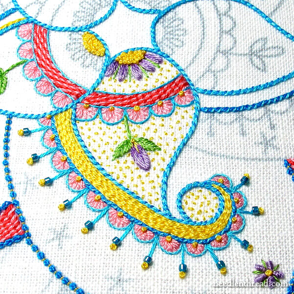
The yellow is a bit bright in this piece, but I’m not quite catching it right in the photos. It’s not an acid yellow – it’s more of a warm, sunny yellow, with the slightest tinge of red to it rather than green (it’s DMC 743).
But that’s the funny thing about color – the interaction with surrounding colors affects it.
I really, really wanted a burst of yellow brightness to this piece, but the jury is still out!
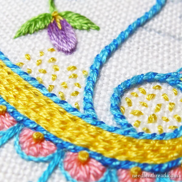
With the paisley elements to the design, I had a notion that the background should be barely colored, since the wider design area around them is not colored. So I used seed stitch to speckle the background with the yellow.
The jury is still out on that, too!
One of my problems is that I know I need to see the whole design complete before I’m certain about the seed stitching for the background, or the yellow on the sides.
When a design is made up of repeats, it’s hard to get a good notion of the overall effect until you’ve worked all the repeats.
I toyed with the idea of making a kind of cut-and-paste mock-up in Photoshop to see how the repeats work out together, but then I decided I’d rather spend that time stitching than mucking about on the computer.
I know this: I don’t dislike the piece enough to start over; and I enjoy the anticipation of seeing it grow.
The line stitch combinations I’m using are fun.
Stitching line stitches – like chain stitch, stem stitch, Palestrina stitch, Portuguese knotted stem stitch, backstitch (which I usually whip rather than leave plain) and the like – is a relaxing pursuit. There’s just something about covering lines with repeated, ongoing stitches that meander along!
And I love the types of textures you can achieve with line stitches if you play with them a bit, adding extra colors, layers, and textures to them by whipping them, lacing them, or couching over them.
But the line stitches drew my attention to a design flaw.
I think the overall design isn’t tight enough. It’s too large, for one thing, and it sports a bit too much open space for my liking. I’ll probably adjust the drawing slightly to see if I like it better tightened up a bit.
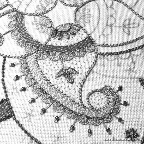
This is the image in gray scale, so that you can see how much (or little) contrast there is between the colors and shades. The values along the outline of the paisleys, especially the scallops and the chain stitch filling (the solid yellow) are very similar. While there’s a slight bit of contrast in the blue outlines, it’s probably not a heavy enough contrast to really make the design pop.
On the other hand… well, the jury is still out on a lot of things!
Today I’m going to stitch on this a bit, to see if I can get it to a point where I can evaluate how much I like the whole thing when it’s worked in repeat.
And yes, I will eventually share the whole project with you – colors, stitches, all of it. The nice thing is, if you want to stitch it, you’ll be able to make your own decisions on colors, threads, and stitch choice, so if anything on my version doesn’t ring true for you, you can always make adjustments.
And that’s one of the greatest things about embroidery, isn’t it? There’s a lot of personal choice involved, and there’s no rule that says you have to interpret a design in any specific way! Very freeing!
So, what do you reckon so far? The main points I’m debating about in my head at this point are seed stitching, yellow filling, and the overall open space on the design.
If you want to join in on the conversation and put in your two cents’ worth, ask questions, make suggestions, critique it… I’m all ears! Feel free to chime in below!
Favorite Kaleidoscopes Pattern Collection
If you’d like to stitch up your own version of Birthday Bash, you’ll find the pattern available in my Favorite Kaleidoscopes collection – over 30 kaleidoscope designs for hand embroidery and other crafts.
You’ll also find the patterns for Party in Provence and Tulip Festival) in the same collection!
The kaleidoscope designs range from small 4″ designs to large 8″ designs, from simple to complex. You can read about the collection in detail here, or jump straight over to my shop to grab your own copy!
Well you had me at yellow. My FAVORITE color! So I see absolutely nothing wrongwith the colors. The color yellow speaks to me as happy, bright and maybe carefree. Which your design speaks of too. So don’t fret Mary, enjoy the journey. Looking forward to see it upon completion.
Incredible! Just gorgeous.
I think it’s just beautiful. I think a dark teal would be nice also.
The seeding is an excellent choice! Originally I didn’t care for the yellow but that addition made it fit perfectly. I can’t wait to see the whole project!!
I’m a bright color person so I love what you are doing. If this were me, I would continue and leave the yellow until the project was completed. If the yellow was still “too out there” I would see if I could calm it down by adding other threads to it. I know yellow is sometimes tough to work with – I had a quilt I made and something about it, made me uncomfortable. But I had a deadline and quilted it. I later took it to a quilt camp and asked for help. It turned out it was the 1″ yellow border that was the issue. We went around the room auditioning various colors of fabrics until we found one that worked. Then we went to the paint table and made a paint that matched. Yes, I then painted the border the better color. Big difference and now I like the quilt. I am not suggesting you paint the yellow, but being as it is embroidery, you could add other color threads amongst the yellow.
I like the yellow, it’s just too much of it. I would maybe try a different color on the paisley tail. I like the pops of yellow that the french knots provide.
Mary, this is a beautiful, happy design, and it draws one right in with the different elements of design, color and detail you have worked into this piece. I have one tiny suggestion. At the bottom of the color design, you have set a small, round stage. It begs for a more complicated filling than seed stitch. I can’t wait to see the whole design!
I think the biggest thing I’ve realised while reading your insightful article is that I will forever be a hobbyist when it comes to embroidery. I never critique my designs in the manner you do- I’m always just delighted to have managed to squeeze in some stitching time.
Your passion and skill is made manifest in your desire to constantly assess and improve your work. I’m rather impressed, even as I know I’ll stick to my own hobbyist ways. It’s faxinating though to read and understand your thought process. Thank you for sharing it. (And in my hobbyist way, I thought your design was lovely – bright and cheerful with just the right touch of whimsy.)
I really like the piece. Have you thought of using four shades of yellow, from “your” yellow to a pale yellow in that mid section? The seeding looks great.
Pat
Great idea!
I would also think about contrast. The yellow may seem too bright because there is no counter balance. The red shade seems out of place compared to the other colors. Maybe an orange in solid color .In the greys the design appears to be more insipid. The seeding in yellow may not be the best choice. Try a different color like a vivid turquoise. I like the sizing and would put flowers in your larger open spaces.
I have been using a tip that I picked up on a EPP Facebook group which I think might help you visualize things. How about photo copying the part you have done enough times to make all the repeats? You could then cut those out and put it together to see how it looks. For EPP, yes, ink is expensive, but not nearly as expensive as fabric and I always seemed to be unhappy with my pieces after cutting. I’m loving this piece,it seems so happy!
🙂 Hi, Joan – that’s pretty much what I meant by photoshopping the repeats. It would actually take less time just to do it right on the computer. But I can definitely see doing that with fabric patterns to, say, work out a quilt design or something like that! Thanks!
I am so enjoying your very inspirational blog – had to jump in and say I think your wait and see idea is a good one. The colours are, to me, quite bright and a big contrast from the usually-muted tones of much embroidery – I like them! And you could always fill in a bit more by doubling rows, perhaps, or edging them?
Love your work and thanks for your generosity in sharing it!
Okay, I’ll confess – this pattern makes me, as a beginner, a little depressed. It’s just so AWESOME! The colors are perfect and each stitch is just right. This is my goal right here – to be able to make something half so lovely! Can’t wait to see the finished result!
I really like the beads with the French knots. Maybe take out the seed stitches and replace them with beads? Smaller beads than the others, and not quite as many.
I like it, Mary! Especially your technique for adding the beads. Can’t wait to see more of this happy project.
That seed stitch was the first thing I noticed in today’s photos. I love it! It’s a totally different texture as a background, and I really like it. The other thing I loved in today’s post was the use of the photo in grayscale to assess the values in the piece. Thanks as always for being an inspiration!
Love it! I really like the seed stitch filling but I’m not sold on it being yellow. I do love yellow but …. It’s just not quite right to me in that spot. Just my 2 cents. Really like the design overall and wish I could make those stitch choice decisions. I just get totally flummoxed if I have to decide what stitch to use — much less stitch combos!
Can hardly wait to see it all done!
I love the yellow and the blue together, but do not care for the peachy flowers in the scallops or the two toned bands. The two-toned bands are a jarring contrast, like slamming on the brakes, but the peach is just dull. The more I look at the design, the more convinced I become that you need to pump up the colors in the purple as well. A really rich blue-purple for the buds and petals (the green is great) a deep, glowing rose for the bands and one tint lighter for the scallops. I’ve never been wild about seed stitching so I’d leave that off at least until everything else is finished. I love the radiating bead element. This design could be great for a little girl’s room in pastels or something much more sophisticated in vibrant colors. Either, but not both at the same time.
I am thinking if you are looking for a contrast how about the seeding stitches in a navy blue type colour? I love the pattern and colours, but understand what you are looking for.
I love the yellow too – I have yellow kitchen cabinets and it makes for such a happy kitchen. But I’m losing my mind over those beads! So perfectly done and so, so lovely!
🙂 my kitchen is yellow, too, Virginia – kind of that deep sunshiny, provincial, folky yellow. I love it for the the cheeriness, but it wreaks havoc on any photos taken in the room, that’s for sure! 🙂
Mary, Tape together 2 square mirrors at right angles. Place the intersection at the center of your design. The reflection will fill in the missing color and you will see your design repeated in the mirrors. This is an easy way to get an idea of the entire image. I use 2 mirror ’tiles’ from hardware store. This little device is also sold to quilters to check their blocks.
good luck!
What a great idea!
I really like your use of seed stitch.
A great way to use an intense color
in a “diluted” effect. I’ll remember
this.
Well, overall I really like it. I like the colors and all the different stitches you’re using. I’m not so sure about the seed stitches. It makes sense that you don’t want huge patches of plain fabric showing in the design portion (the paisley for example) since it’s not part of the background. It’s the star of the show. But yellow dots look too random to me. LOL I know – they’re supposed to be random. But the rest of the design is more intricate and solid. Wish I could visualize something else but my mind isn’t that creative.
Just wonder if you changed the pink for another colour, maybe a teal/deeper blue?
I love this piece, have always loved paisley. In regards to the yellow, I’d prefer a butterscotch yellow (still can’t get the candy shop idea out of my mind) but with the yellow chosen the seed stitch background helps reduce the brightness of the yellow. The white spaces don’t bother me, in fact I like the openness it brings, light and airy. I love your work and your works. Been enjoying your website for a while now. Your tutorials are the very best. Could tell immediately you were a teacher by the way you break down everything into simple steps that are easy to follow. One teacher identifies another immediately. You are the best and the only one I subscribe to. Can’t wait until your next posting! Keep on keeping on!
I love how colorful it is. It reminds me of walking into my garden and picking what’s in bloom. First some Lavender, then yellow Yarrow, coral Penstemon and some Amsonia or Blue eyed grass. Put them together in a vase and enjoy the mix of color together. Don’t overthink the mix. Just enjoy!
LOL! True, Carol. I often overthink things, and I find doing so can be detrimental to getting things done! 🙂
Dear Mary
I like it all the stitching the thread colour combination. I like the seed stitching the yellow and the open space it looks lovely and your stitching is perfect. Carry on as it is and I think you will see that it will look good when this you have stitched all the elements in the project. Thanks for sharing your progress on the paisley kaleidoscope design with us and for your photos and comments.
Regards Anita simmance
Thanks, Anita! I will carry on! It’s very suspenseful – I’m really eager to get to the point wheee I can get a real idea on the repeats!
Hi Mary,
I love the bright colors (and I’m not usually a “bright color” girl). I also love the seed stitching! In the gray scale picture, I think I’m more aware of the thickness of the lines compared to the overall design – maybe a little out of proportion? But I do really like the design! Modern quilters are using a LOT of white space in their designs, and while I don’t like quite so much white space as they use, I find I’m liking how more white space gives the eyes a place to “rest”, and the rest of the design has more room to “glow”. You can probably find pictures of modern quilts on the usual picture sights. Your colors really brightened my day!
No suggestions, just an observation.
This blog is exactly why, through the ages, women have always gathered to stitch together. Thanks for including us.
Hi,Marita – such a nice point, and just what I hope Needle ‘n Thread can continue to be!
Hi Mary, I’m a great admirer of your work and have carried on numerous little conversations with you in my head, but I don’t write you as I’m still a very imprecise and somewhat ignorant stitcher. I like dark colors, random stitches,
and vague shapes generally, but this pattern and the light, bright colors gave me such a lift of the spirit that I felt I had to let you know. I look forward to seeing the whole and may even aspire to trying to reproduce it for myself. Thanks.
Aw, shucks, thanks, Gaye! I’m so glad you like it!
I think the problem is the value of the yellow compared to the blues and the pinks (corals?)- it’s a much more saturated value than the other colors, which are paler. Your color values are out of balance.
I like the design the way it is, but I’ll be interested to see what you do with it.
Hi, Paula – the pink and dark pink are both in the same color daily – just opposite on the shade range. It seems to come across as red and coral (maybe because I normally use that color combination, because I’m not much of a pink person), but in this case, it really is candy-pink – a bright dark candy pink, and then a bright light candy pink. It’s just not coming across really well in the photos, I think. Maybe I should go for more of a medium value in that range, for the fill? I will test that! Thanks!
I really like the yellow & the seed stitches! The design and the colors you’ve chosen are delightful!I wouldn’t change a thing❣️
Thanks Patti! 🙂 Hey, how’d you make that heart?!?!
Hi Mary, I think the paisley looks very good so far but how it works with the whole design, only time and your deft hands will tell. Can you tell me what fabric you are using please, it looks very kind to sew on, rather ran some of the more difficult velvets for example. Thanks for all the advice you give us, I’d be lost without it.
Hi, Angie – this particular linen is called Alba Maxima by Legacy Linens, from Access Commodities. Linen is a Very Forgiving Fabric overall, which makes it great for testing embroidery projects. It’s one of the few fabrics that you can unstitch on with very little evidence of unstitching! In this article here: https://needlenthread.wpengine.com/2017/05/picking-out-stitching-the-fabric-difference.html I wrote about this exact subject and showed the difference between cotton and linen when unstitching.
have you thought of using angled mirrors (dont know what they’re called or where to buy them, i googled diligently!) to reflect the part of the design you’ve finished so you can get an idea of the whole?
hopefully someone else will have more information. love love your work, you are an inspiration.
Hi, Rebecca! Thanks! Yep, I know what you mean. I’ve done it in art classes in years past. I suppose I could dig out some mirror tiles!
What a great idea to look at embroidery in a gray scale image to see how the colors contrast! Is that a couched palestrina stitch in the third picture? So pretty. I think choosing colors is very difficult. In fact, that is what usually stops me from embroidering. I went through a redwork phase (in hot pink though- ha!) so I could just stitch and not think about it. I want to use colors, and I can pick out many that I like, but when they are combined they just don’t look pleasing. (I don’t know enough about color theory to talk about why they don’t look good, I can just tell that something is off.) How did you go about learning floss color combinations?
Hi, Colleen – on this particular piece, I just went with a collection of colors I gathered out of my stash, that were bright and chipper. I didn’t go beyond that, really! But there are some good books out there that can help you with color. I particular like Color Confident Stitching: https://needlenthread.wpengine.com/2017/03/colour-confident-stitching-a-gem.html You can read my review there, if you want to see what it’s about!
Mary, I love this design. The colours are ones I wouldn’t necessarily choose naturally but seeing them gives me a real lift. It reminds me of the need to push out my colour comfort zone: thank you. How do you get your seeding stitches looking so evenly spaced? How do you decide density? Any tips on this gratefully received.
Best wishes Helen
PS love needlenthread. Thank you
Hi, Helen – I pretty much just eyeball the placement for the seed stitches. Density is a matter of what you’re trying to do with the seed stitches. If you want a light fill, space them farther apart. If you want the fill to be heavier, space them closer together. Well….that’s how I tackle it, anyway! Some folks also shade the seed stitching, and I thought about doing that here. But then I decided to keep it as is. For example, though, I could have done the base of the paisley in either a little darker shade or worked the stitches more densely.
Your color choices are a little to bright with to much contrast for my taste in that type of design. Except for my Dios de los Muertos patterns I prefer mellower colors with more shading. But as they say, to each their own.
Happily stitching in Jerome, AZ.
What if you sprinkled in a bit of orange/coral with the yellow?
I almost went with a whole multi-color fill, like the one in this voided monogram: https://needlenthread.wpengine.com/2016/08/how-to-embroider-a-simple-voided-monogram.html….but then I didn’t. It was a bit much. It was like Candy Shop on Steroids! 🙂
I love the use of the grey scale image to check for contrast, thank you for sharing that and your thought process it’s very interesting and informative. Hope your stitching on this project goes well and I look forward to seeing your progress.
I think the colors work great together!
I love what you have done so far. It seems very happy to me, and I love Paisley designs any way they come. One thing that might give you a sense of the project as a whole is a set of mirrors that are attached in one side. I don’t remember the name for them, but quilters use them to test out a repeat in fabric for a calidescope quilt. It won’t give a true read of the design because of the mirror image, but it will give you a sense of the overall design and color placement. And, you don’t have to take away stitching time on the computer! Love all the beautiful things you create and your willingness to share your talents with the world. Keep up the good work!
Thanks, Mimi!
Love these colors.
What is the stitch used in the circular design. The thread is pink. Thx
I have a tutorial for that here: https://needlenthread.wpengine.com/2012/05/stitch-play-diagonally-striped-raised-band.html I also used a variation of it in the Lattice Jumble Sampler: http://shop.needlenthread.com/product/lattice-jumble-sampler-guide
Morning Mary:
I love what you’ve done so far and I like the colors too. The weight of the colors also make a difference to the design. If you want to see what repeats look like without completing the whole thing you could use an old quilters trick ~ get two mirror tiles from the hardware store, and set them at an angle on your piece so that they meet at the center and the bottom edges follow the division line of your pattern. The mirrors will reflect your embroidery and each other. Of course, this is only going to show you what a four part repeat will look like but it will give you an idea of what multiples will do to the design.
I had completely forgotten what gray scale does in designing a color scheme and usually just rely on ‘really’ low light (think candle strength) and squinting at the colors. Gray scale really shows up any glaring mistakes doesn’t it.
Looking forward to seeing how this design progresses 🙂
Best regards,
Brenda
Thanks, Brenda!
I love the yellow, it brings the piece to life.
🙂 Thanks, Velia!
Hi Mary,
Been following you for a while and thoroughly enjoying the journey. I’m liking this design and the colors you chose. As for the seed stitching: in my view, there just aren’t enough “seeds” to fill the area given the color choice. So, if you stick with the yellow, which I like, by the way, perhaps scatter a few more into the mix and see if that helps.
Ahhhhh, thanks, Linda! I’ll see how that would work!
Mary, I just love your website / letters! I am fairly new to the joy of embroidery and slowly familiarising myself with some of the beautiful stitches I am learning along the way, but, for what it’s worth, I love the seed stitches, please leave them. They add a delicacy to the piece and lift the yellow off the fabric.
I look forward to seeing your progress and enjoy the many ideas I gain from being a part of your forum. Good luck!
Hi, Judy – the more I work with the seed stitch – I’ve managed another paisley today – the more I like it, too!
I have to laugh Mary, cause everything you are worrying about pleases me to no end. I like these colors and I do like that it’s a more open pattern. I’m as excited as you are to see how you finish it.
I do enjoy your musings as much as your needlecraft.
🙂 Thanks, Charlene!
Hi Mary,
I love the yellow! It will be beautiful and less prominent in the finished piece, with more colors and stitching to distract the eye. Golden yellow always gives things a warm glow and a rich feeling. Can’t wait to see this finished!
Thanks, Marty! I’ve done a little more work on it already, so it’s coming along – might be there before we know it, especially if I have some dedicated stitching time this weekend!
Hi Mary: I really like this design, and the colors. It is bright and happy, really brightens up my day to see it. I wouldn’t change the colors, but I don’t like the seed stitches, don’t know why, they just look wrong to me. On the other hand the bead and French knot “dingleberries” are adorable, and just perfect. I also agree that the little round space at the bottom of the paisley is crying out for a fancy flower?
Hi, Joan – Thanks! Ahhhh…perhaps on the central fancy flower – we shall see!
This is just FUN. I love your idea of a splash of yellow, and I like it everywhere except where it fills in the space. What if that were done in BLACK? I don’t know, just seems like it might look kind of cool and make those blues really pop.
Thanks, Sara! I did initially try a dark blue there, but it just didn’t quite do it. I’ve thought about using black as a tiny outline on parts of it, and I haven’t quite discarded that idea entirely yet.
I absolutely love the colors of this project. I can see how you might think the yellow is too bright, but on my monitor, at least, it is perfect. Maybe I am biased toward yellow. I can’t wait to find out what colors you used, and perhaps pull them from DMC thread for my own project! I love the different blues used together.
Thanks Susan! That’s the thing – colors do look different on monitors. On my computer when I formatted that picture, the color looked almost right, though still slightly towards the green hue. When I looked at it on my mother’s computer this afternoon, I was slightly surprised – the yellow was almost shocking. 🙂 Part of the problem here, too, is that I haven’t been setting up the right lighting for “formal” or “official” project photos. I’ve just been using my phone!
Mary there are mirrors that are used a lot in quilting which allow you to see a full version of a portion of a pattern.
So by setting two mirrors on a section of a design (a wedge) you can view in the mirror what it would look like in a circle.
Probably clear as mud but it works well for me.
🙂 Yep, I understand, Susie! Thanks for the tip!
I really like the seed stitch in yellow – it fills the space but is not ‘fighting’ with the heavier yellow area. As for the colors, I find them very interesting. I am a more ‘monochromatic’ person/artist and I find this a refreshing change.
I also like the variety you are putting in the ‘line work’. I haven’t embroidered much in the last 30 yrs. as I have been involved with Bobbin Lace and quilting. I am really enjoying your Blog and plan to do a Crazy Quilt in the near future. I have been filling away for later many of the stitches you show.
Overall, I like all of your colors. I’m not even bothered by the lack of contrast. It is a very bright and happy palette. I agree that teal would work very well with that you have going on. Maybe even a bit of orange. I think it is charming that the French knots read as beads in the black and white photo.
Thanks Sherry! 🙂
If you have them, how about using a couple of small mirrirs, held at an angle to each other over the stitched part to see how it looks repeated? Like a Kaleidoscope in fact!
🙂 Exactly!
I’m going to side with your doubting self about the yellow color in the filling. It doesn’t seem to me like a “pure” enough yellow, like it has an odd, muddy quality about it, maybe red as you mentioned. I think a more clear, pure yellow color would play well with your other colors. (Love the design; I’m sure you will find a way to resolve your dissatisfaction with the open spaces.) 😉
Love the colors in his one, but feel that you need to add a dark value–either a forest green or a deep brown. I’m drawn to the brown because it refers back to the yellow, which is the color that’s worrying you–brown isn’t really a dark yellow, but they’re close relatives. The dark value would be used as a means to direct the eye through the pattern.
Thanks, Eileen – I may indeed try that!
Hi Mary,
To get a quick overall idea of what the finished embroidery will look like, you could colour photocopy/scan the embroidery you have already done and print it out the number of times needed to complete your design. Then you can cut out the shapes and lay them out in a circle to see what the overall effect will be.
Quilters sometimes sit a hinged mirror on the blocks they are working on. This multiples the image so they can get an idea of what the whole block will look like. If you have any quilting friends they might be able to loan you one of these gadgets.
Best wishes,
Ann
I suggest you go to an online fabric store and check out paisleys. For instance equilter.com. In search type paisley and check out the monochrome pieces. You may see what you are searching for. I can’t wait to see your final design.
I like the yellow in the design. It is a bright happy color. I think if the outlines were in a dark blue that would make the other colors pop and add definition to the design elements and also provide contrast.
Love the design. I love paisely so it works for me. Looking forward to seeing the completed piece.
I do enjoy having the freedom to critique.
Mine is a rather simple comment…..i love the yellow and the color of yellow you’ve used. I tend to use certain colors carefully, and yellow is one of them.
However, the yellow you chose speaks to me about your personality in this piece of embroidery….warm, inviting, happy, optimistic and much more.
I don’t know what the piece is for, but besides bright the colors seem child oriented. Maybe that is just “dark” me, but even though I love the design and stitches, and use of beads, I can’t get excited by your color choices. I’m the one who is frequently called naive and rose-colored glasses thinking, but in this case it’s too cheerful for me. I liked the grey version so I could see past the colors. That’s why they make chocolate and vanilla, right? I see others have suggested the mirrors to get a broader view. I would definitely do that. I don’t mean to sound negative in any way since I am a HUGE fan,
Barb in CA
Well I like all your colors, and definitely keep the yellow since that’s where you were drawn to first. I do think the seed stitch just doesn’t have enough oomph, so I two directions to try. One is to add another seed stitch color along with the yellow seed stitches. I would go with a darker gold trending into oranges. Or, replace the yellow seed stitch all together with the yellow new color. I sure hate to undue done if it can be modulated.
Also do you have one of those angled mirrors that quilters use so that you can replicate your design to your eye with out having to do all the work first? It’s two mirrors hinged together on one side that you lay standing up on your work and it will reflect your whole pattern.
Another thought I had was to angle straight stitch rows about an 1/8″ apart on the outline in the seed stitch area (or outside!), as a sort of shading effect. Not sure about this, you could try a small area first, I think you would know right away. Good luck on your choices, it’s sure fun to tag along.
Hi Mary. Looks good so far. I like the yellow but am not so keen on the mid blue next to it. Would a darker blue give more contrast?
So far, I love it all. I would not change any of the colors or stitches.
Hi Mary! I love your candid honesty in all of your posts! Nevertheless, your embroidered projects are BEAUTIFUL!!
I’m not an expert at embroidery,in fact, I’m just a beginner. After reading your concerns about this “paisley” project, I thought I’d chime in. So…perhaps the paisley would be best without a circle in the tail. Also, the dot filling is too busy for the overall picture; how about something more filling: and vary the direction and color of filling stitch. Lastly, I’d put one of your “stars” in the absolute center ( only larger than any other anywhere else in the design). Hope I was helpful. I’m looking forward to seeing your completed project! Stay healthy and thank you for sharing your wonderful ways with threads and words! ~S
I love the yellow seed stitch in the main body of the paisley. Not sure about it in the base part – does that need any fill at all? Or in the circle – is it the right stitch or colour for the space? But who am I to ask! I wasn’t too sure about the deep pink last time you showed it, and now I think it’s great.
I love it. These are colours I work with. I also work a lot in variegated thread. Paisley is my pattern of all.
Dear Mary I hope your well. I love this, love the colours you are using, we alway have doubts about our work that goes with being very creative. Beautiful looking forward to seeing the finished work. Keep stitching and many thanks to you for sharing. Patricia x Australia
I like the yellow, i love the way it makes the project “pop”. I’m not a fan of the yellow french knots, but without seeing the whole thing, it’s hard to tell. I can’t wait to see the progress of this. Thank you so much for sharing 🙂
I struggle with colors in my stitching and quilting (fabric selection). I never thought to take a photo and then change it to gray scale to see the contrast. Thank you for demonstrating that!
Have you ever tried using the red plastic viewer (can’t remember the correct term) that quilters use to come up with values to determine light, medium and dark contrasts. It’ s the same as the grey copy you used but this tool really shows the differentiation of values of the fabric colors? Just looking at the grey sheet, there is almost no contrast with the peach, so maybe try using the lavender color that looks as strong as the red and dark blue? Contrasts aside, I do think the colors are very pretty and go well together. When I wasn’t sure of colors (in quilting) I always draw the block on graph paper to try out different colors.
Please, please, please will you label all those wonderful stitches so I can tel which one each one is?
The yellow pops for me, and I love the seed stitching. Just right. Keep going! I’m enjoying your happy piece.
Your work is just gorgeous
Really love your work and all the tips and hints you share.I am a way beginner but am learning as I go along. I did print your gift .I thank you for that ,looks like a great challenge for me. Question,I purchased a transfer pen thinking I could go over the print and then iron it on the fabric,yes or no?
That’s correct, Maureen. Trace the lines of the printed design with the transfer pen and then iron it on.
Mary, I like it’s flowing nature. The other day I was stitching and I didn’t like my color combo. So I took one of those scrap pieces you convinced me to save in one of your other posts and re-stitched that area in another color and pinned it on to my design. Woo hoo! That was the answer. But, I didn’t pick-out what I had already done. I just overlaid some of the new color and in each matching section, added more and more of the new color. Lacing is great for that!
Your design reminds me of a summer day in Santa Cruz, California; Big Dipper, cotton candy, and all.
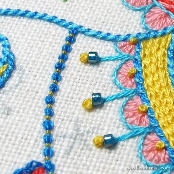
Now how in the heck can you put on beads without getting tangled round them when you stitch? I always have to put them in at the very end.
Yep, I usually sew the beads on very last, but I wanted to get the whole sense of what a segment would look like, finished – so the rest of the beads are going on at the end! 🙂
Hi! I enjoy your emails greatly. I also enjoy a bit of brightness in my needlework, but I feel that the balance is off slightly. The pink in the picture seems to be a bit soft compared to the blue & yellow.
I hope this helps.
I like the blues & the yellows. Personally, I don’t care for the peachy colored chain stitches. This color doesn’t look vibrant enough. I’m also not wild about the seed stitch because it leaves so much of the ground fabric exposed. I’d rather see this area filled with one of your beautiful lattice filling stitches.
Loving the effect you are getting with the seed stitch around that sweet little purple flower — both the texture and the color are a perfect foil to the more highly textured and colored bands surrounding it. It’s a winner!
I really like the colors you have chosen…they are all clear and suggest playfulness and a certain innocence that i tend to associate with clear and bright colors. I think the whiteness of the ground really contributes to this and seems to be very much a design element in it’s own right. So there’s the two cents….lol!
I LOVE THIS! I suppose your more trained eye sees the “flaws”, but my unskilled observers eye takes delight in your work! Thank you for sharing.
As for me I would like to see it done with a black background and bright colors
Hi Mary – I’m sure you’ve thought of this already but thought I’d throw it out there. Quilters use a hinged mirror (2 mirrors at right angles) to view quilt blocks to see how they will look when repeated and set together. You can see secondary designs and evaluate how the colour will distribute over a larger piece. Would that work to evaluate how you like your elements for the design once it’s been repeated? Not sure if it would but just thought I’d suggest.
Could you not use one of the mirrors that is used in doing the blocks where you repeat the design 6 or 8 times and see how that this portion might look if repeated several times?
I like the colors you have chosen. I’m a bright person love colors. Is the kaleidoscope design (pattern) for sale? Was looking through your website but wasn’t able to fine it. Love the updates on your progress.
Sydney
Your stitches are so beautifully uniform. I just love seeing them.
Thanks, Royann! 🙂
Mary, I think your embroidery is looking great! Although the only swap I’d might make, is changing the yellow stitching too a bright orange! Wondering if that’s enough of a contrast you may be seeking? Regardless I’m having heaps of fun learning some new stitching from you, to add to my crazy quilt project. Many thanks, Julie.
I’m absolutely loving it now!
Thanks, Marita!
gorgeous!! I’m looking forward to the patterns for this and The Tulip stitchery!!
Hi Mary-
I’m a little behind on my email – this piece is probably already finished and framed! A couple of thoughts…I like the bright yellow in small doses, but the solid bright yellow seems to draw my eye away from the piece as a whole.
Also, I would LOVE it if you would design a similar piece (I’m partial to paisley) with maybe 10-20 basic stitches and create a series of lessons for people like me who’d like to embroider, but really don’t know where to begin! I’ve done some pillowcases & guest towels and counted cross stitch, but I want to be able to do what you do!
Well, on a simpler scale….My dream project would be to embroider your beautiful pomegranate!
Thanks for another great post!
~Diane
Just a tip, I know the project is finished already. Instead of playing with it on a computer, there is a Jinny Beyer quilting tool, it’s basically two mirrors attached to each other on a flexible seam. If you can fabricate or make do with two mirrors and angle them about 45 degrees. The reflection will give you an idea what the full pattern will look like. You may want to set the mirrors so they catch a partial repeat on the left and right, but a full repeat in the middle and play with it, until the pattern comes true. The black and white photo for the values was also a really good idea!